Contract work for Spanx via OnwardSearch | 2012-2013
About
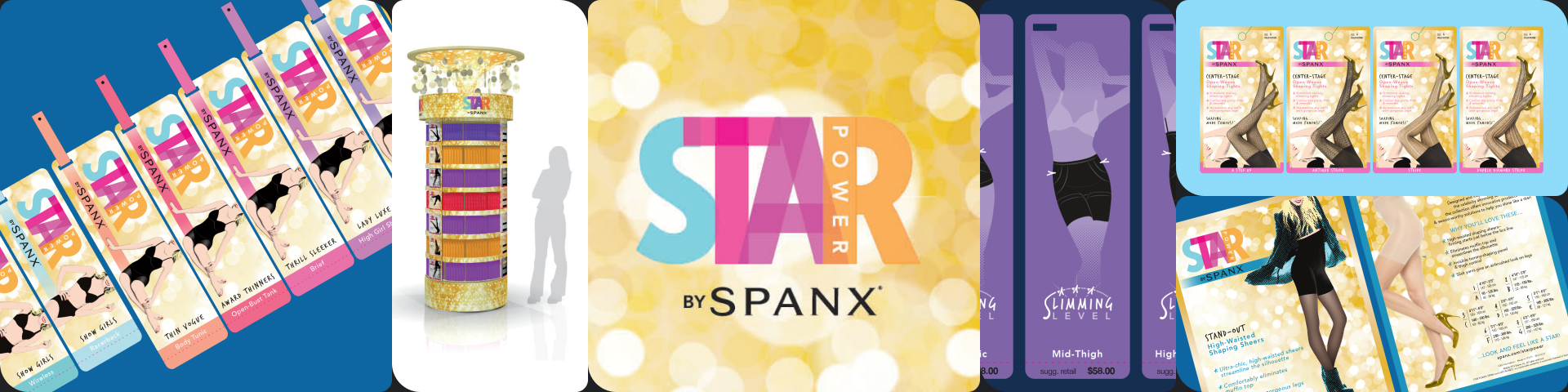
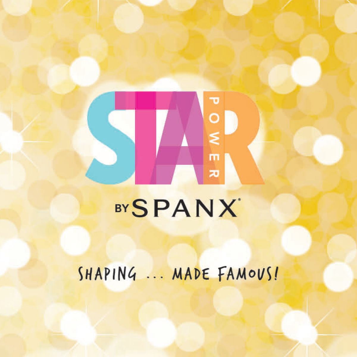
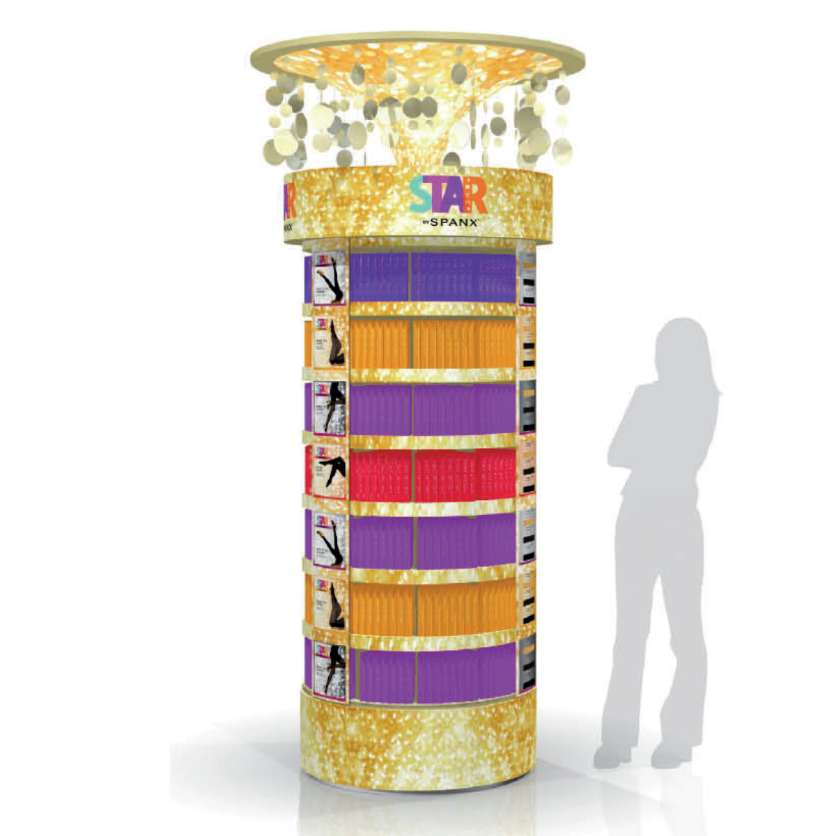
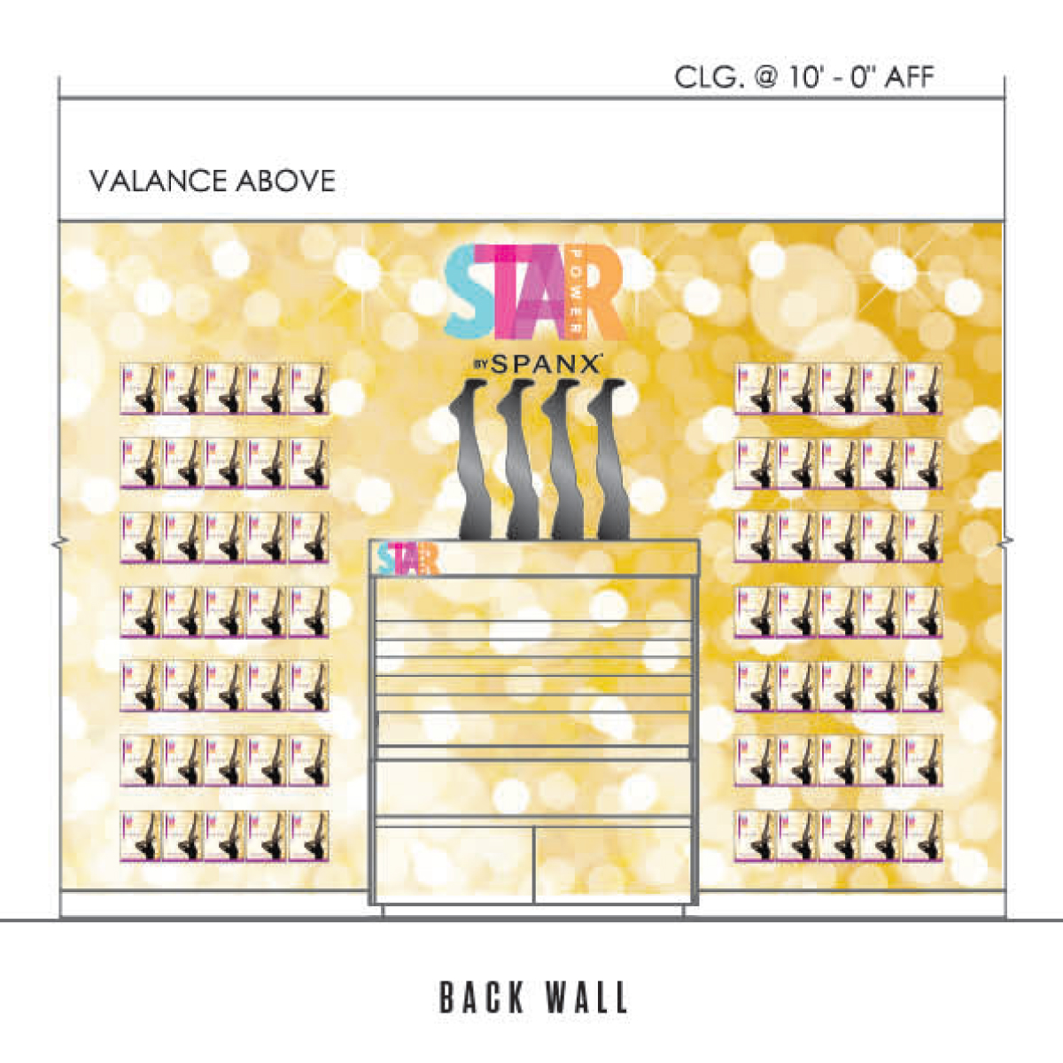
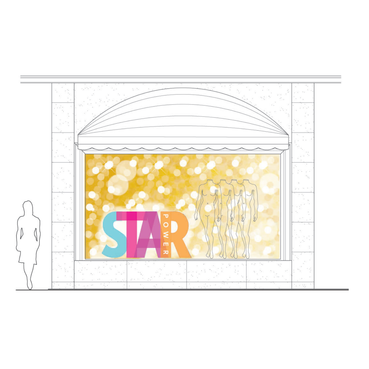
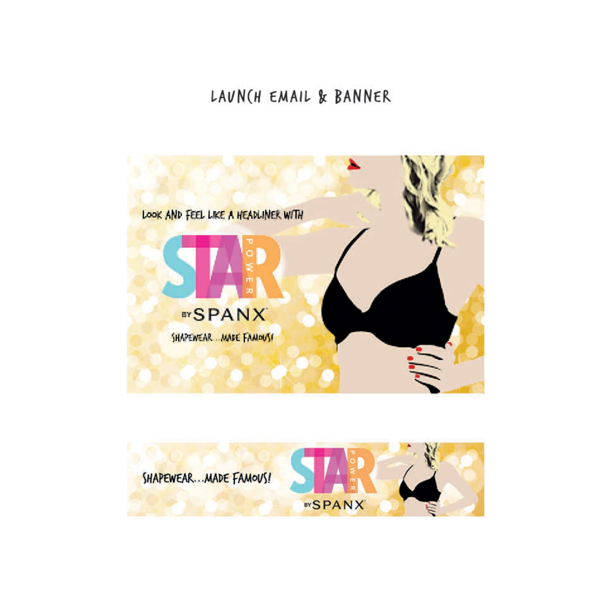
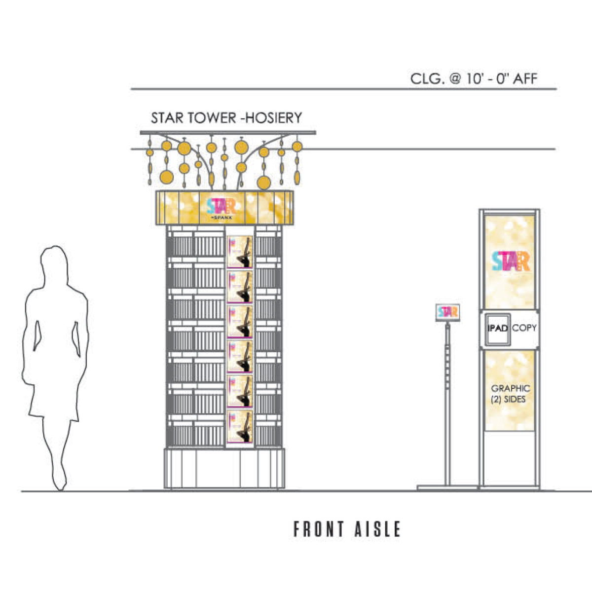
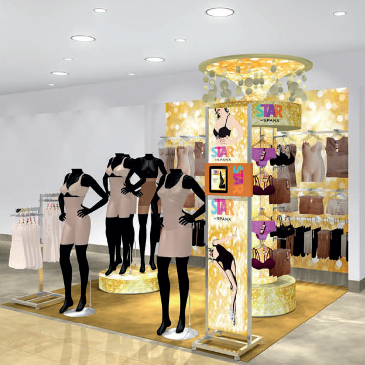
STAR Power by Spanx was an exclusive brand going into Macy’s stores in August 2013.
When I was brought on board in November of 2012 the project had… stalled. My entire contract was getting it across the finish line on time.
What I walked into:
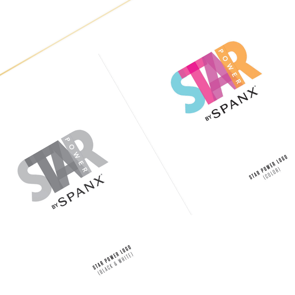
The logo was more-or-less “approved,” but not finalized. And definitely not production-ready.
The tagline was still “iffy.”
The fonts were not chosen.
The color palette was still in flux.
The overall concept of the “1940s blonde bombshell” who would appear on all of the branding was still undefined.
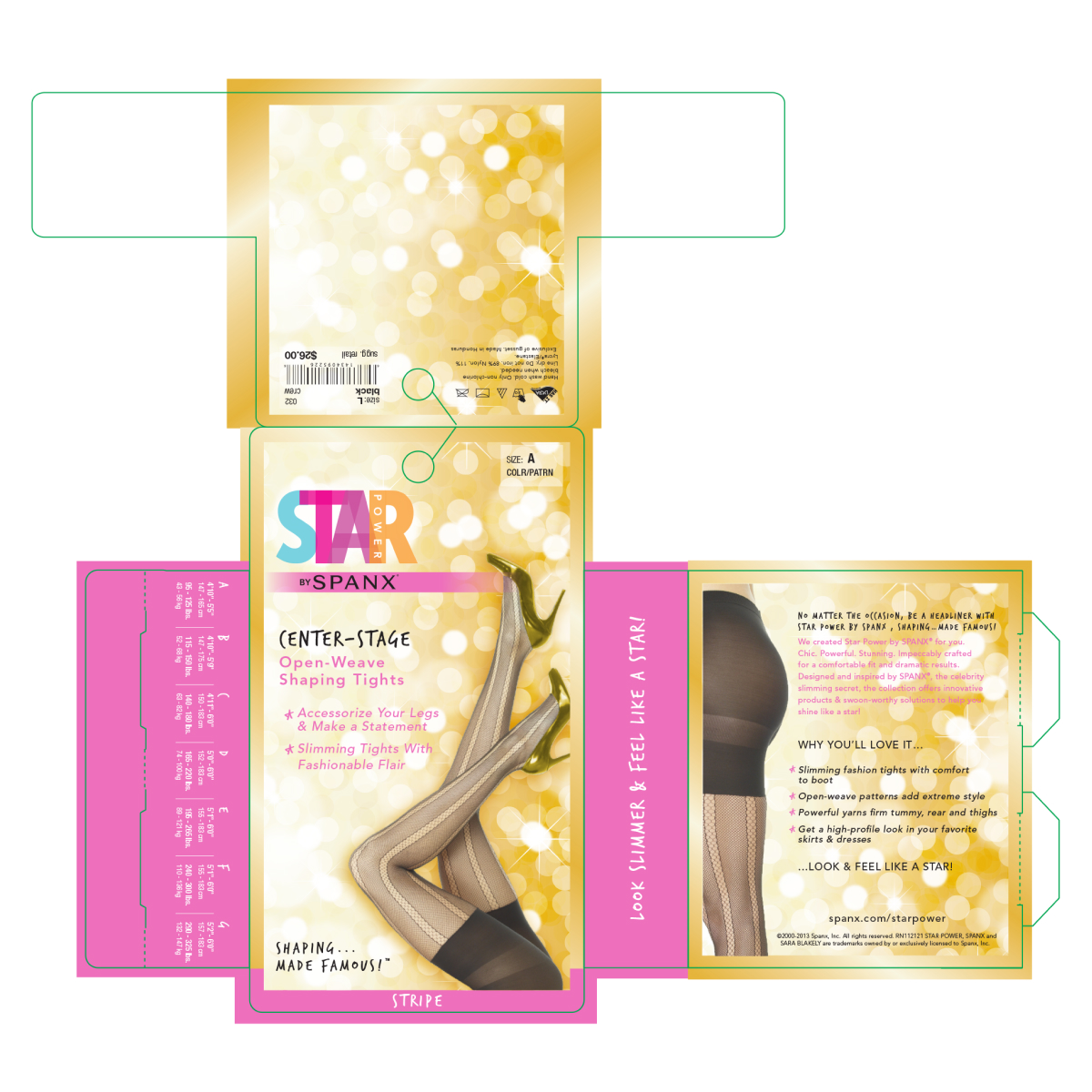
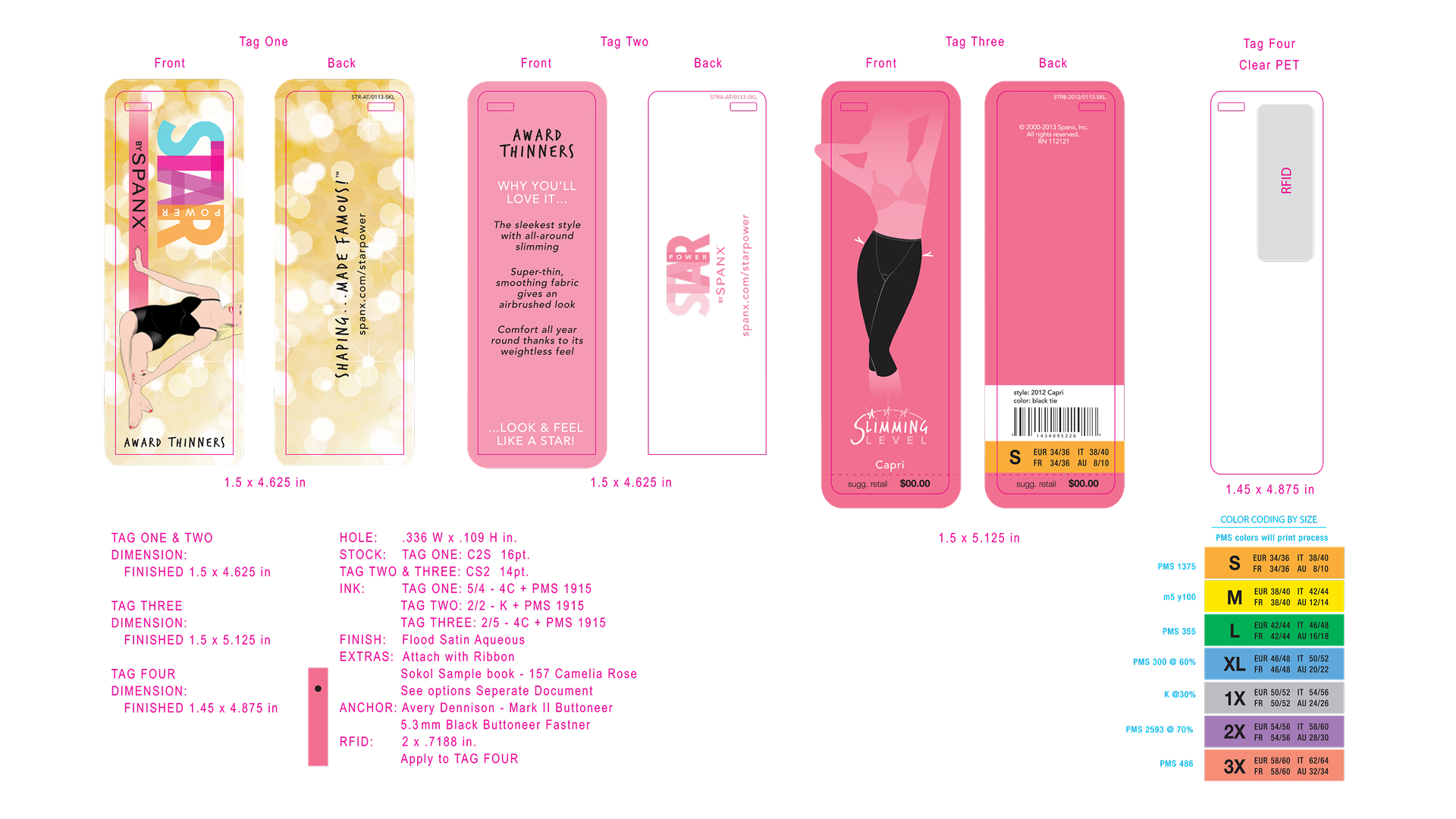
None of the packaging was approved and several of the SKUs needed their entire die lines made.
What followed was a LOT of long nights in their office. Reams of printouts. Daily reviews and revisions to the entire lineup. One small color change would cascade to every other piece across packaging, digital and the in-store experience.
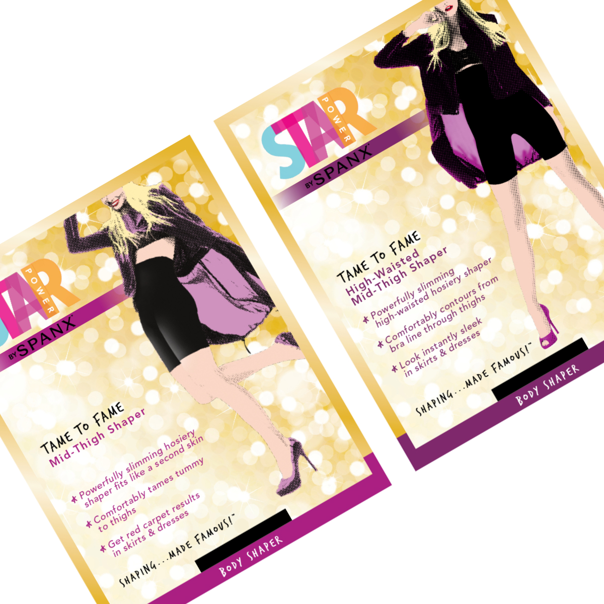
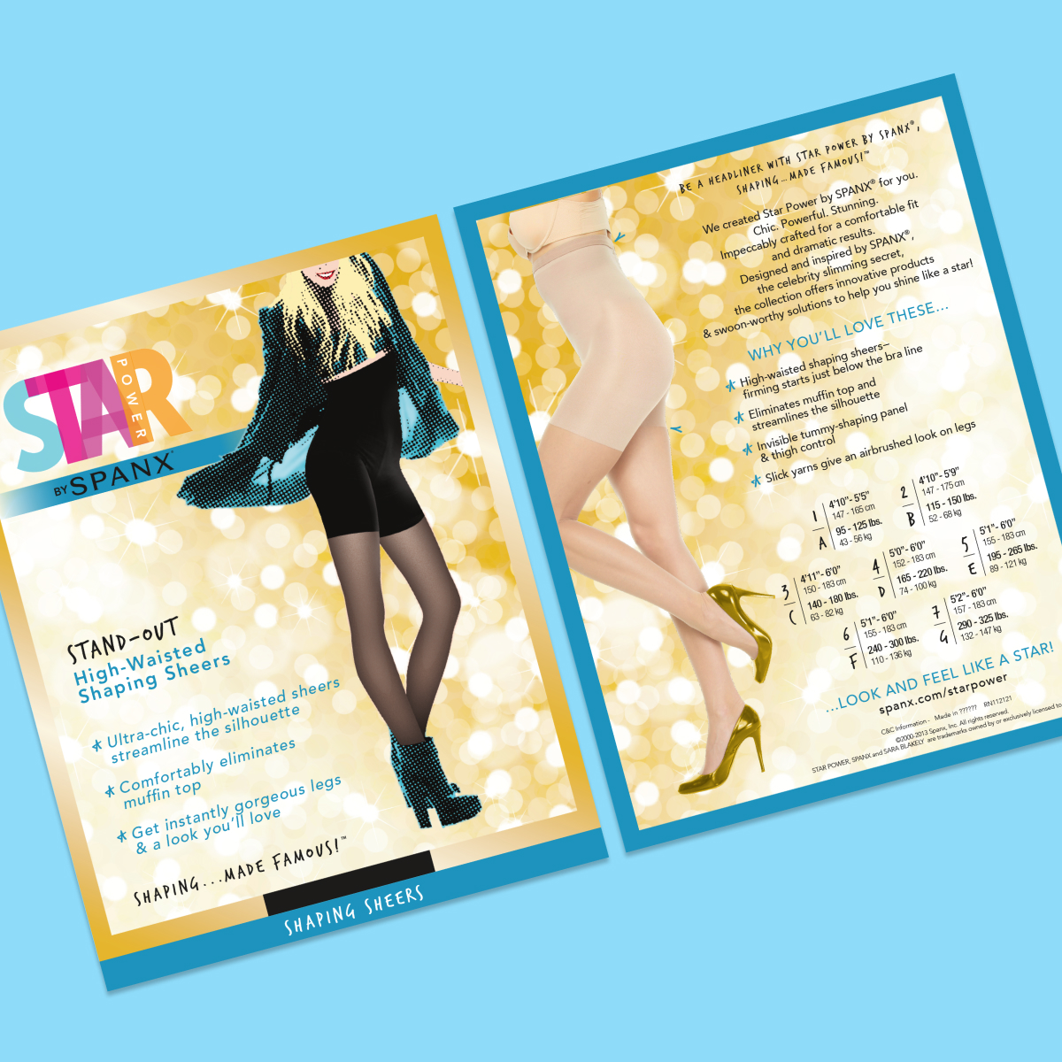
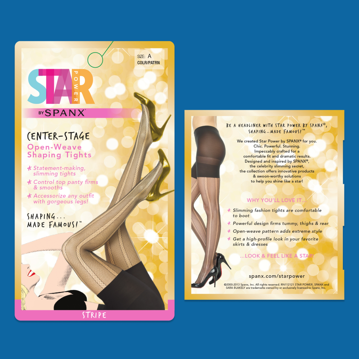
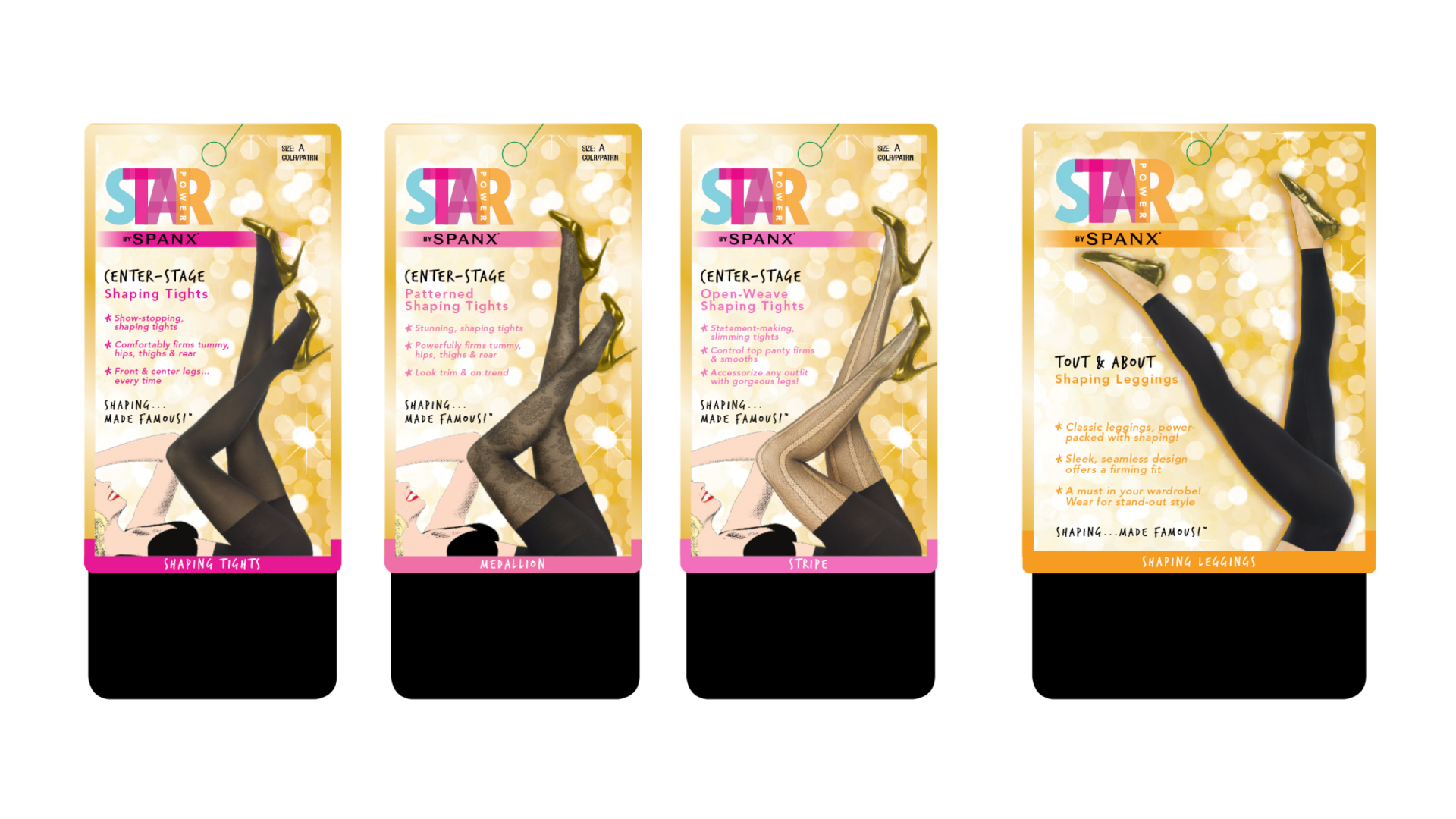
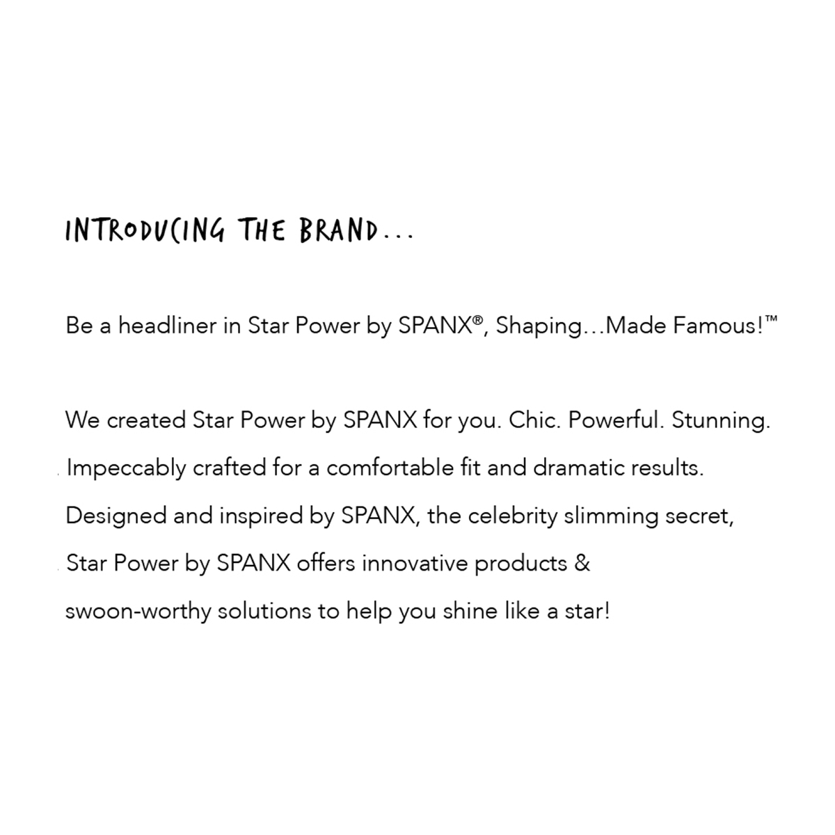
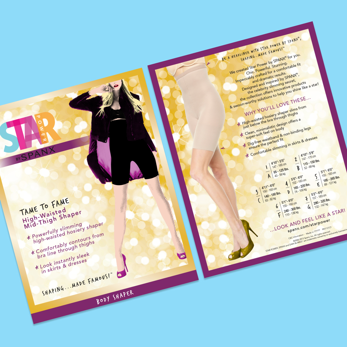
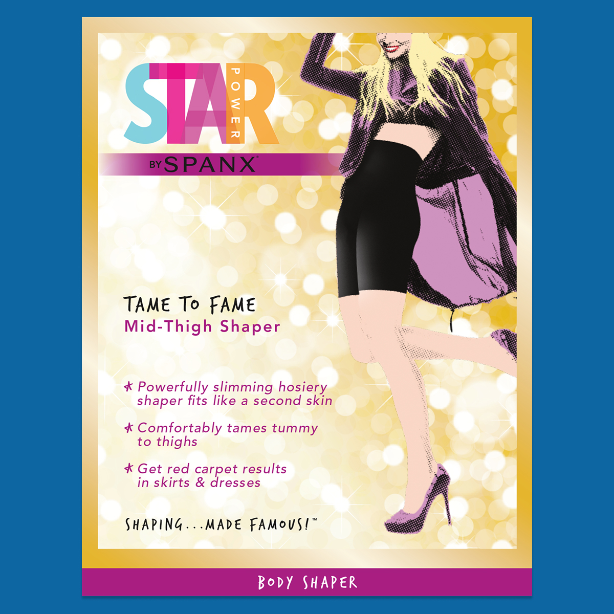
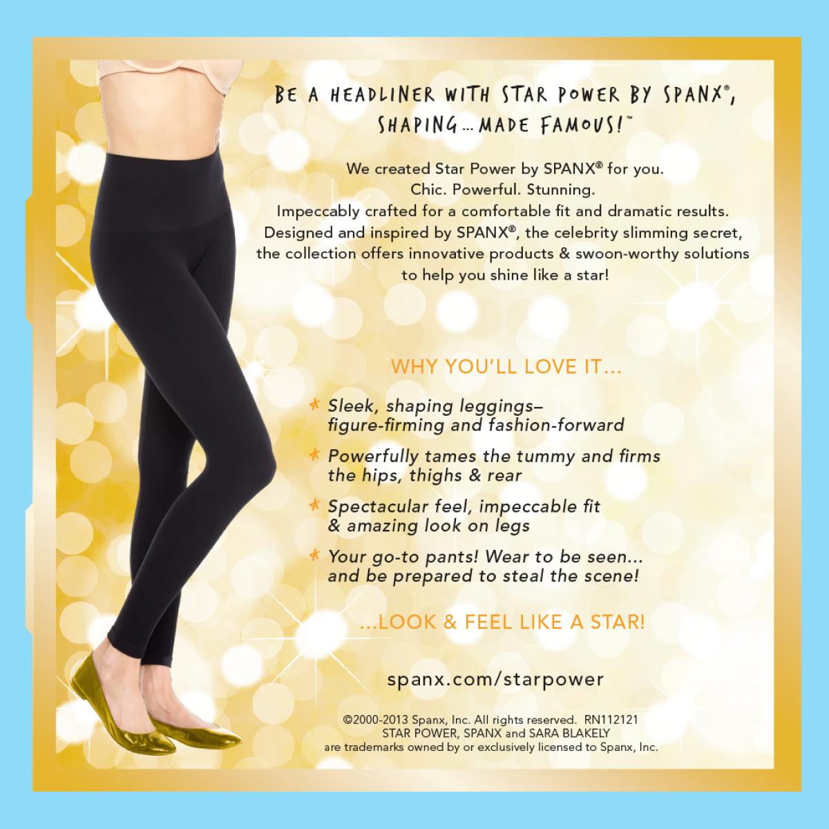
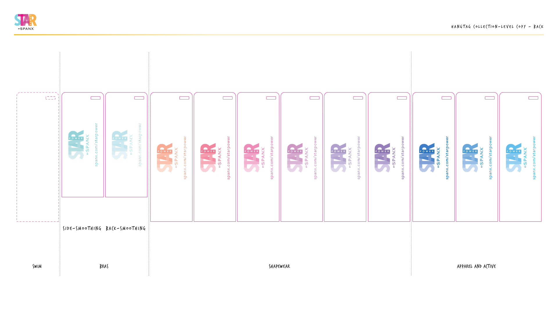
I wrote more copy in three months than I think I’ve ever written for a single brand (and this is after having been at Dippin’ Dots for more than five years). My line, “LOOK AND FEEL LIKE A STAR” didn’t get to live as the final tagline (that ended up being “SHAPING… MADE FAMOUS!”), but it was on every piece of packaging after the product description.
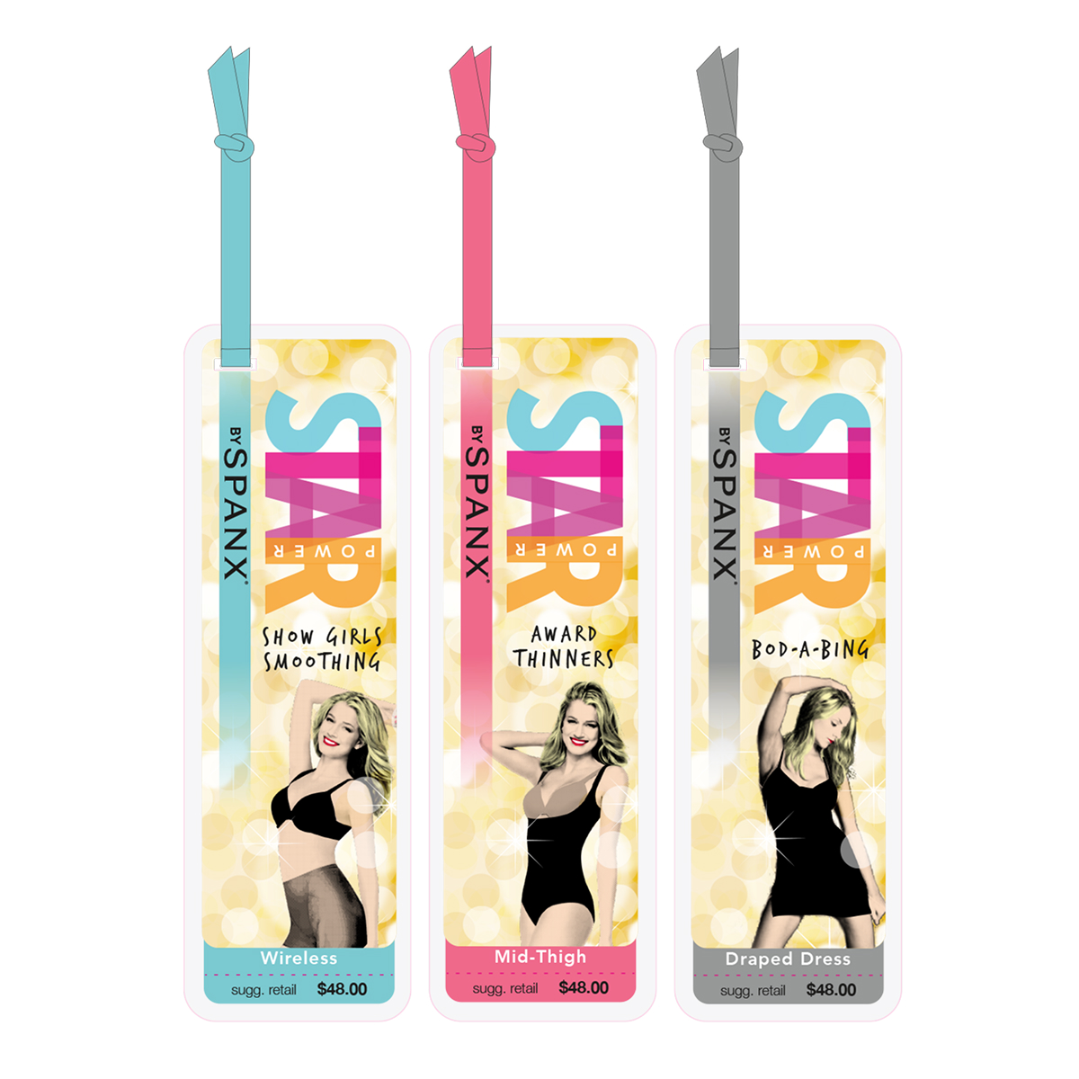
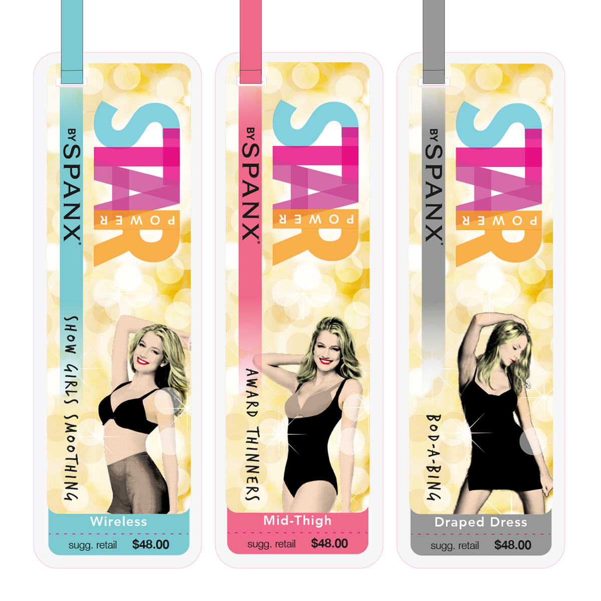
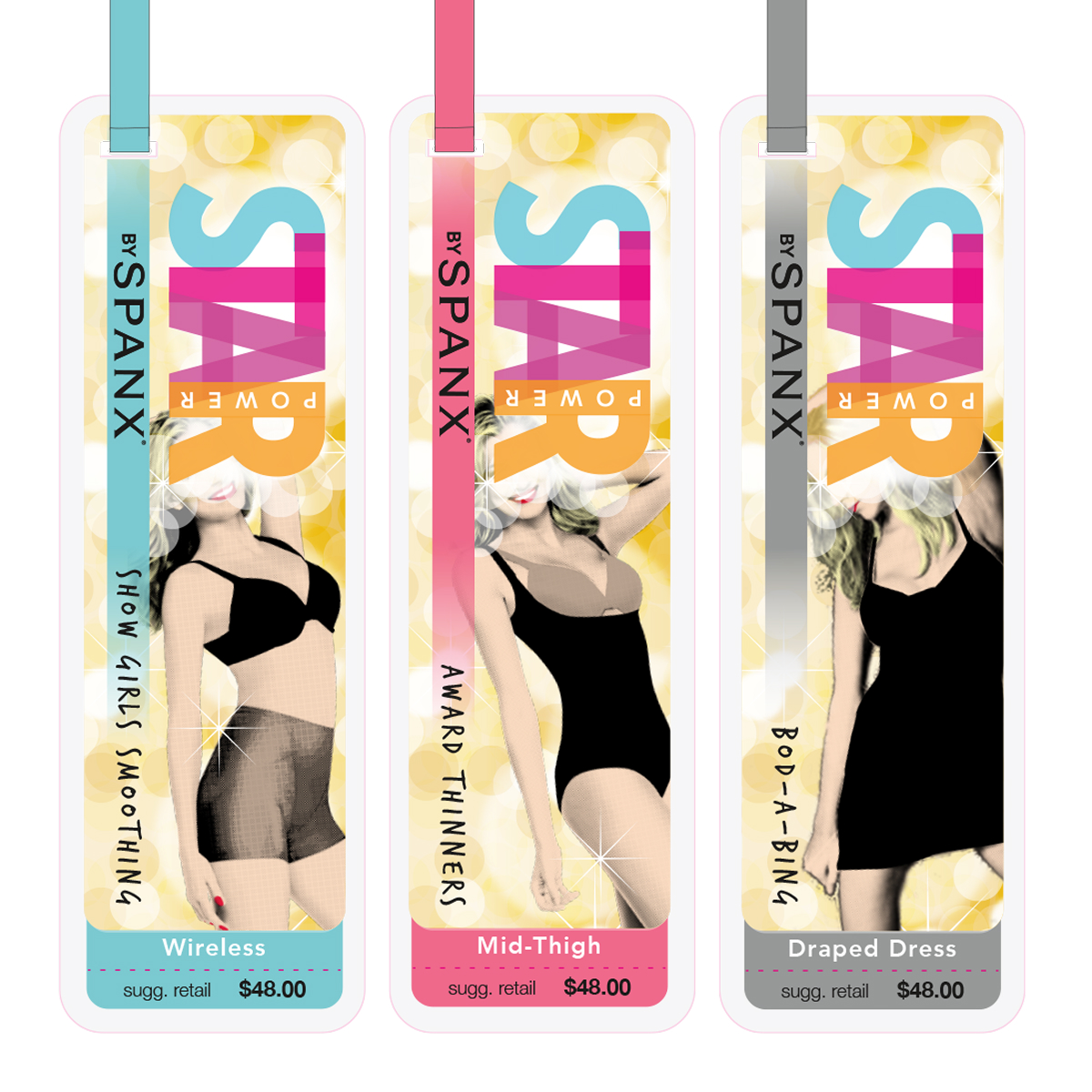
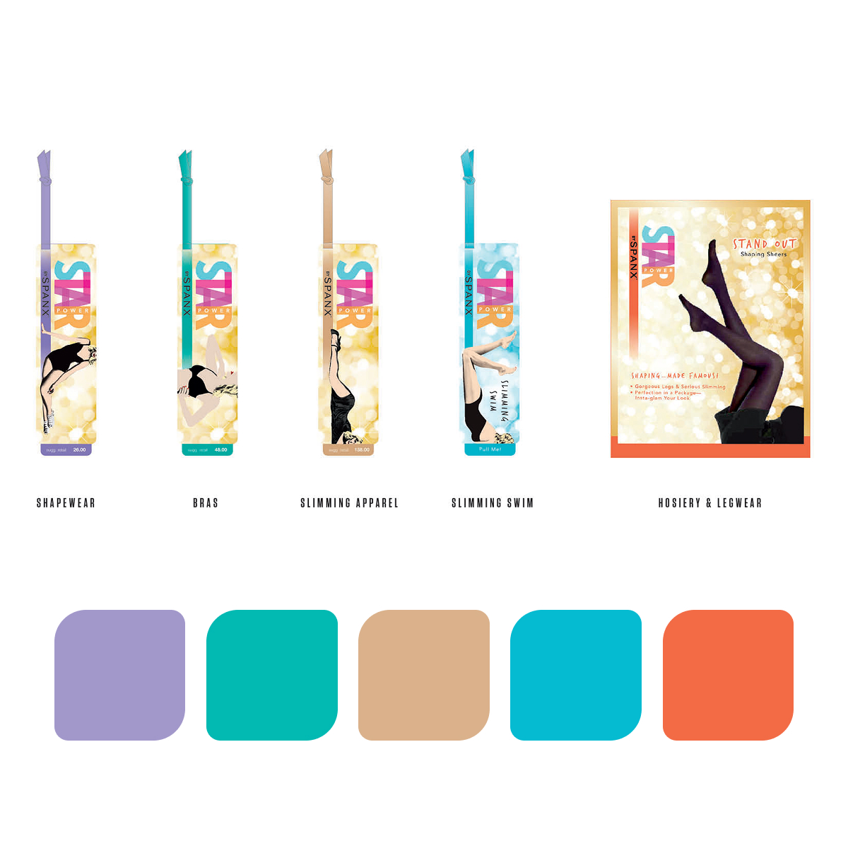
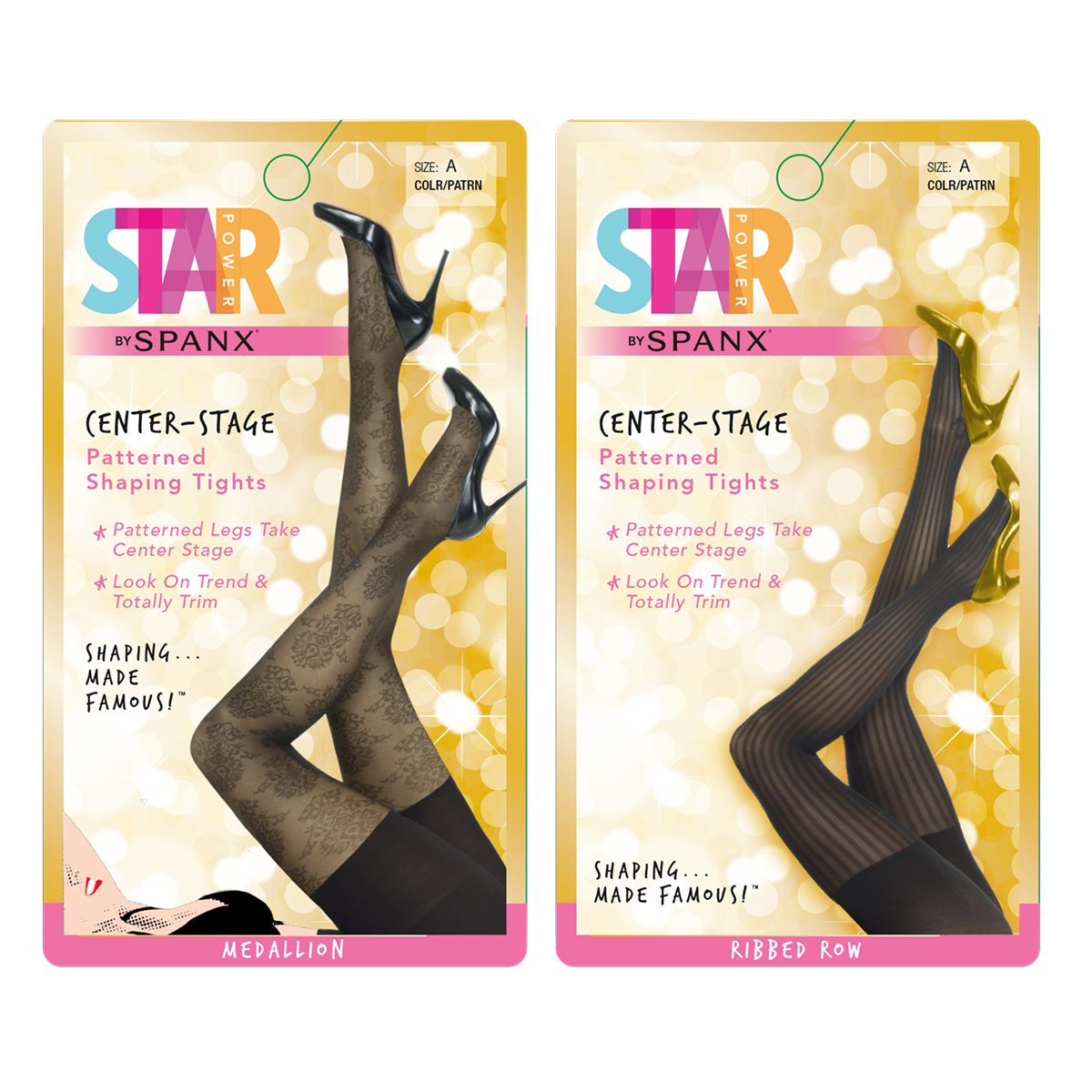
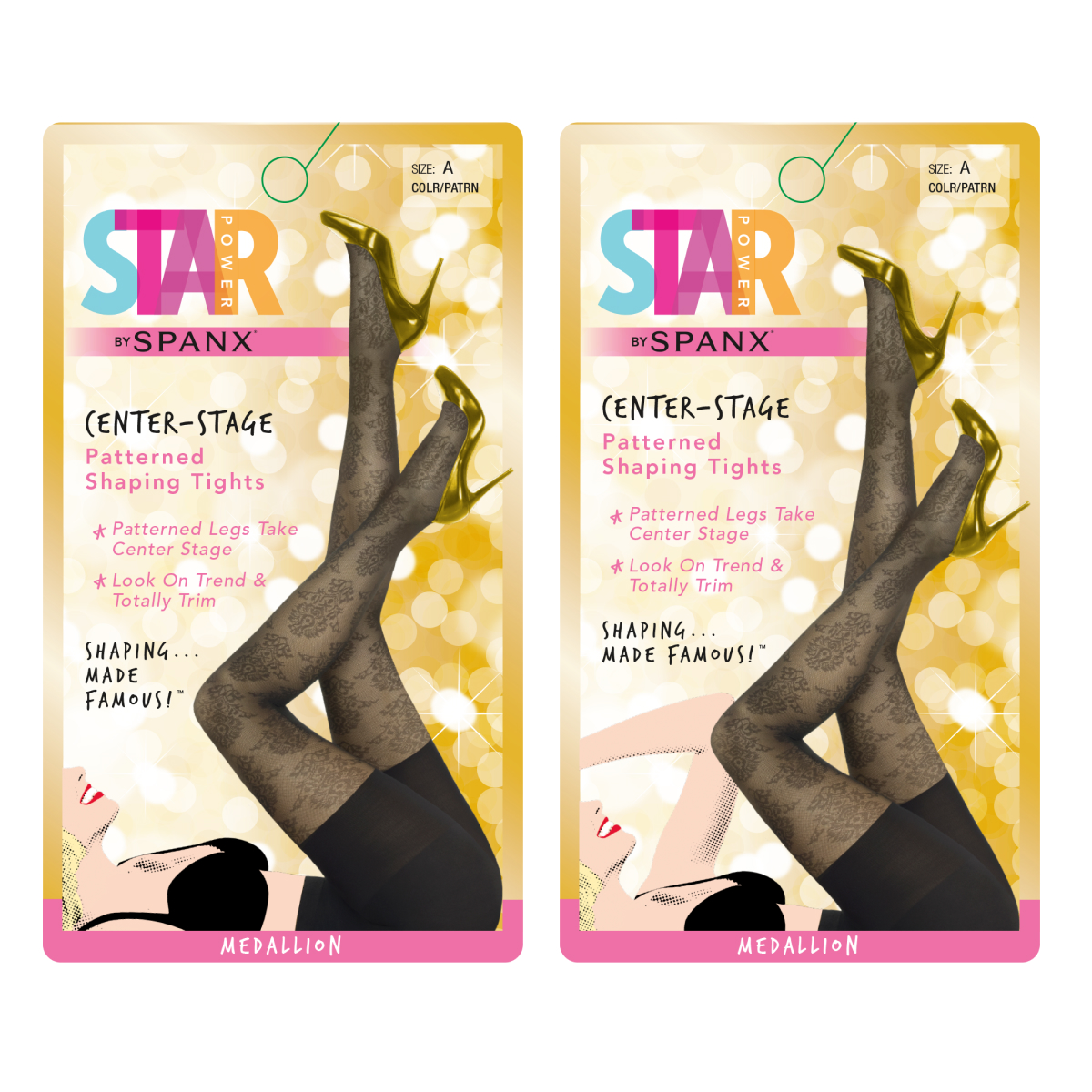
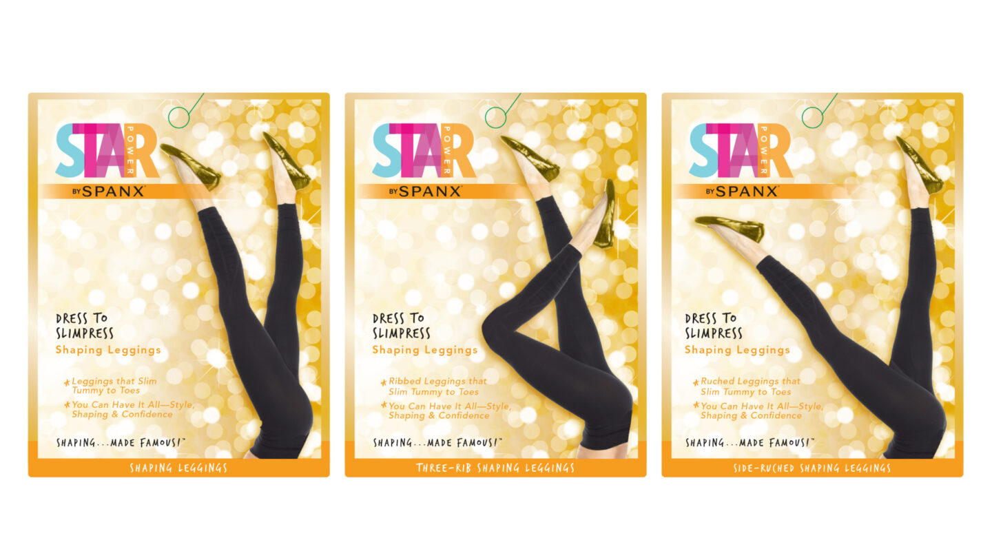
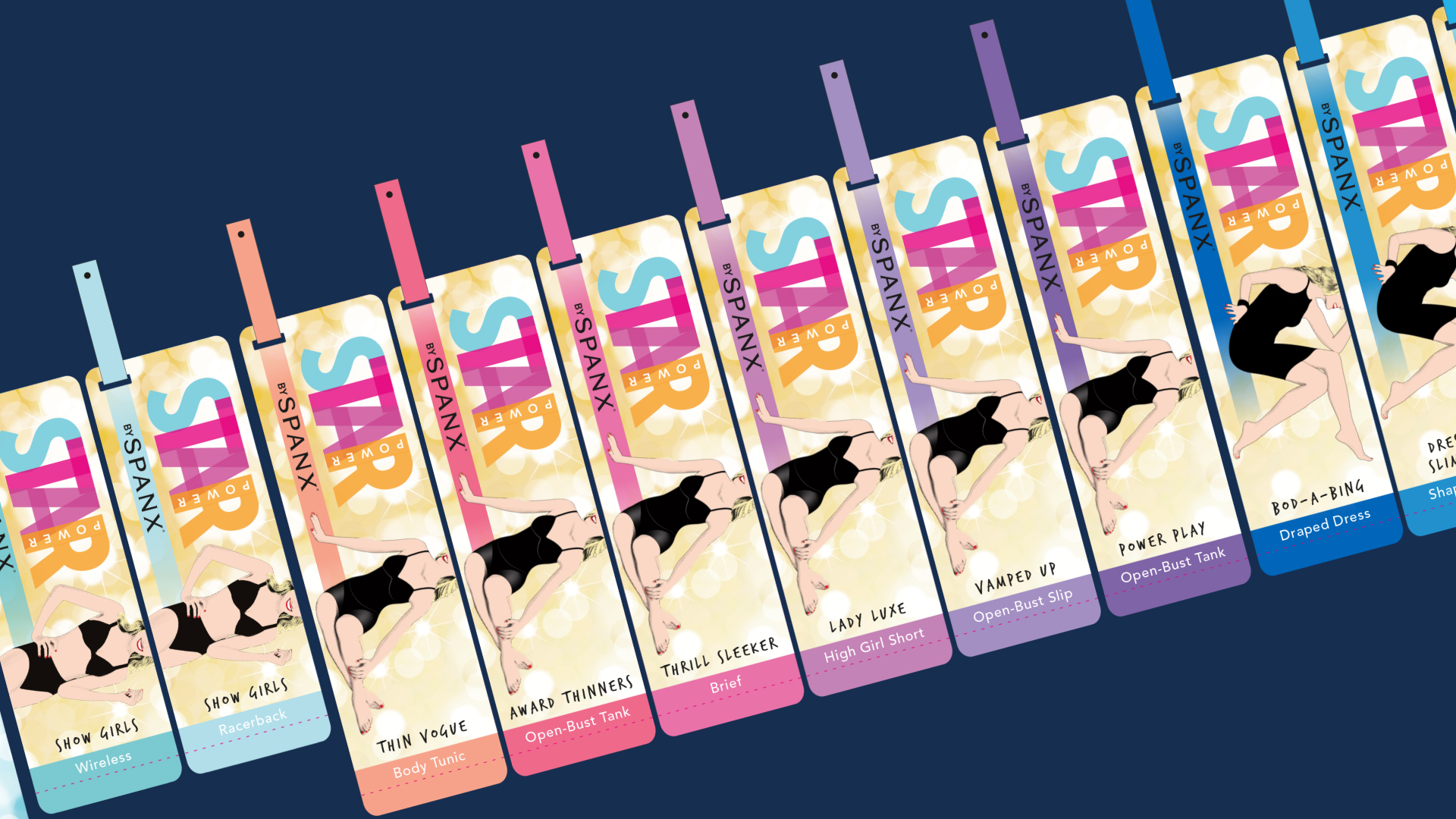
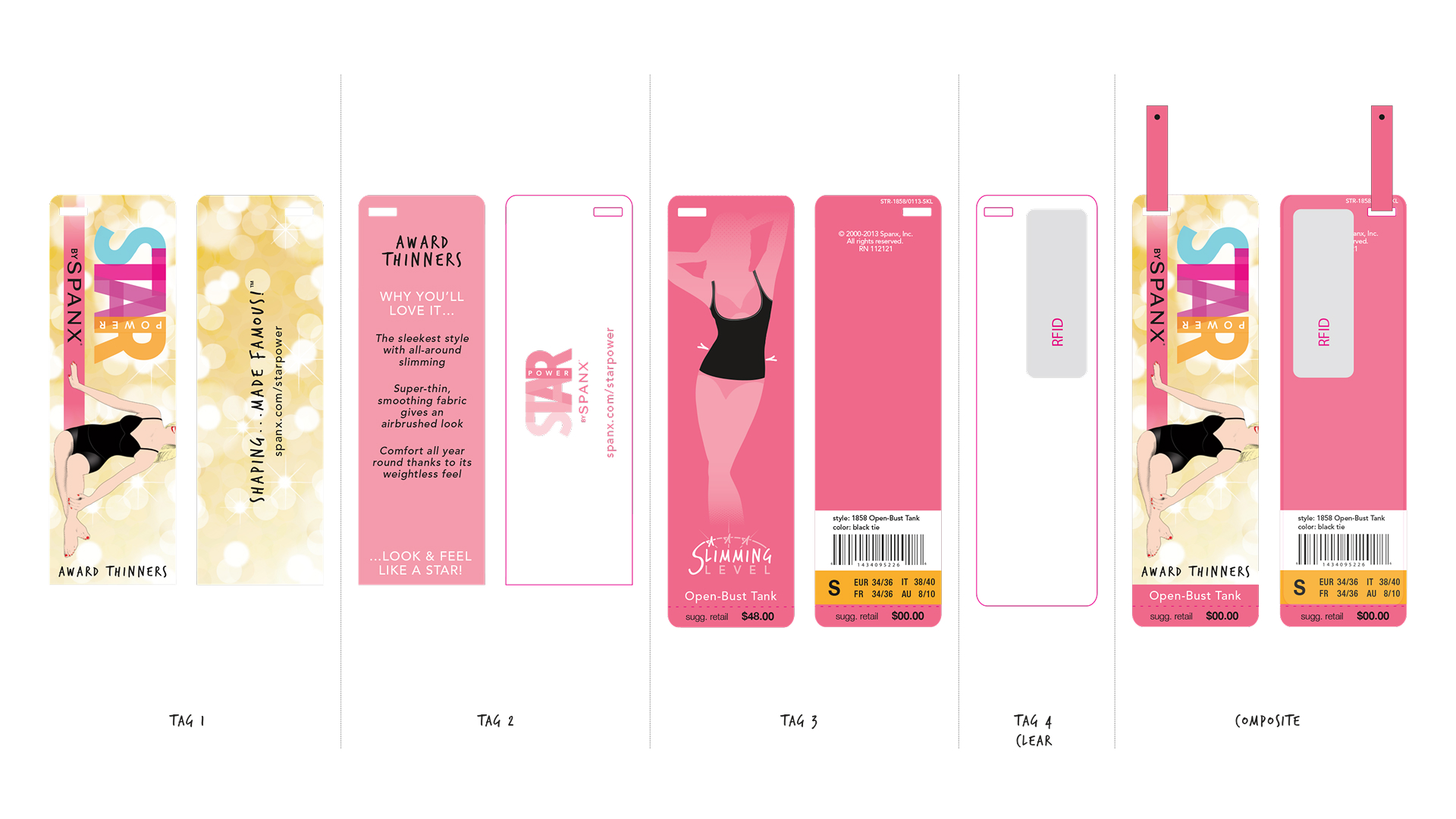
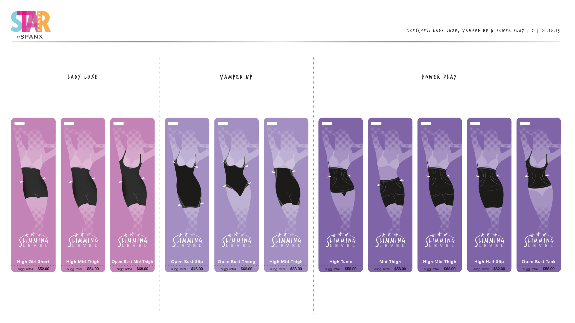
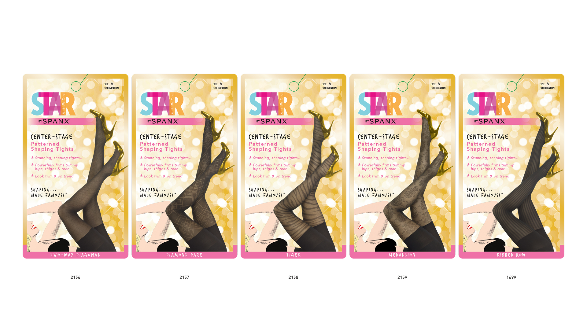
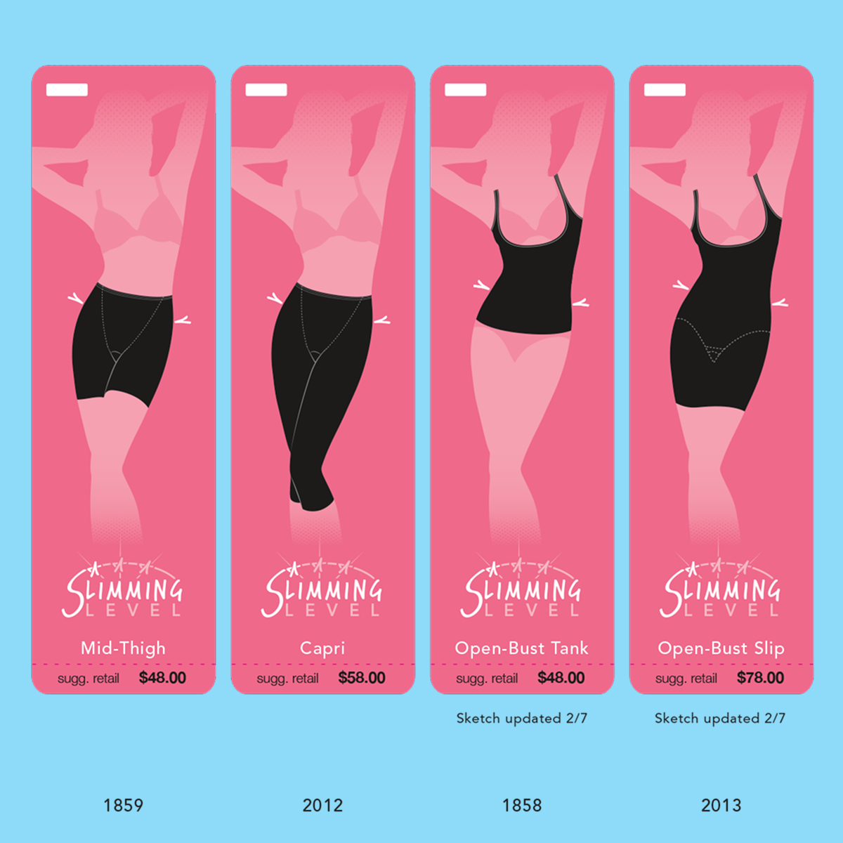
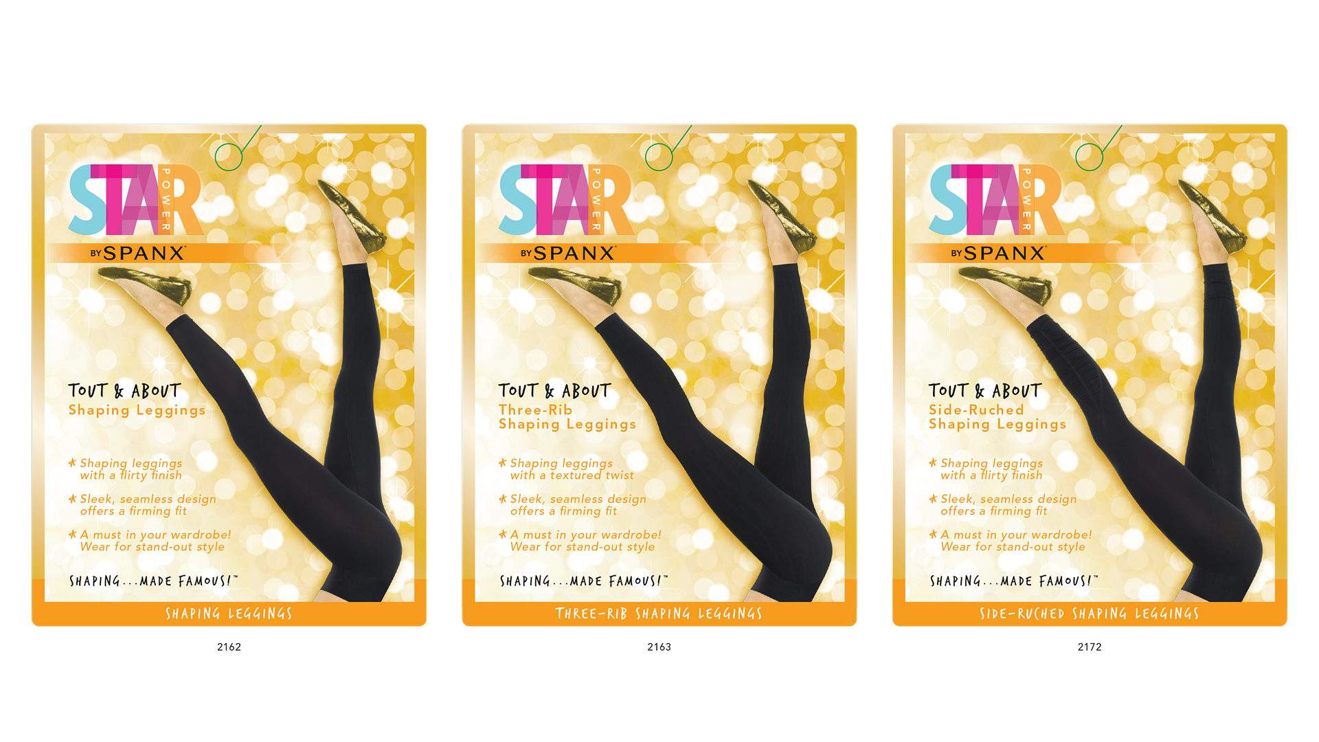
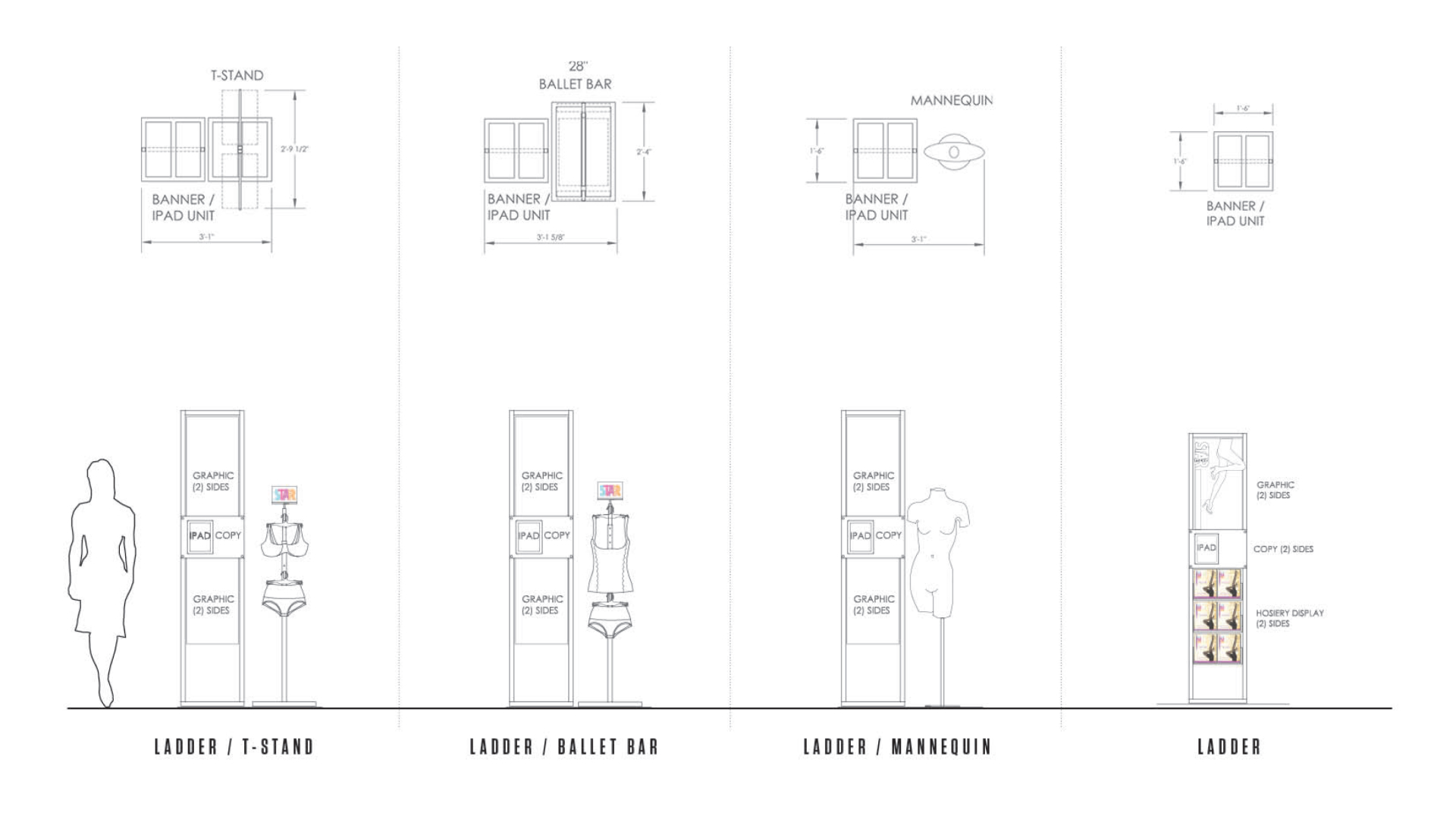
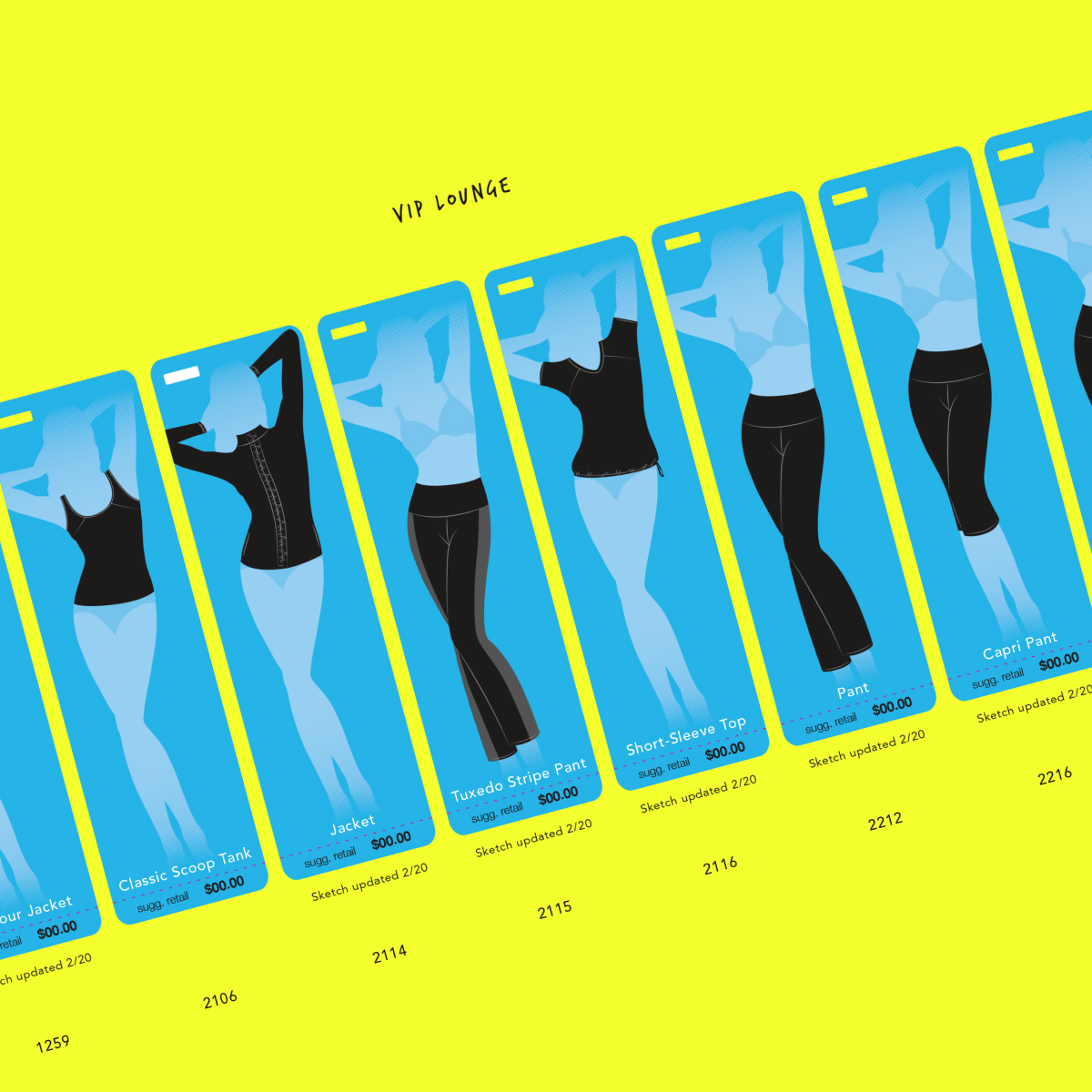
The product lineup kept changing, too. Thirty-six products became sixty in a week. Which meant the design system had to be both flexible and expandable after my contract was up. I illustrated every product silhouette on the hangtags, so I was constantly re-drawing products as the Product Design team would make changes.
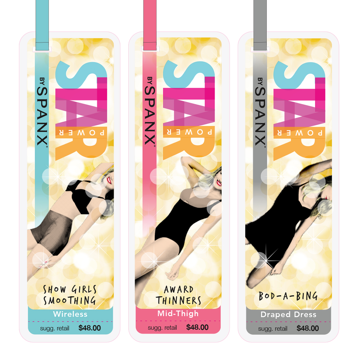
The Bombshell went through a bunch of iterations, too. The gold background pattern used everywhere could be glitter… it could be camera flashes… either way, it was a lot of dots. So I developed that into rationale behind adding a halftone dot screen over a high-contrast image of the model. Dots on dots. The early versions showed an entire model, but this evolved so all you saw of her face was her perfect, red smile.
The earliest version of the Bombshell
The "run the name up her armpit" version
The first version where her face started to disappear
The "falling off the hangtag" version that moved the product name to the bottom for the first time
We went through some… interesting… color palettes.
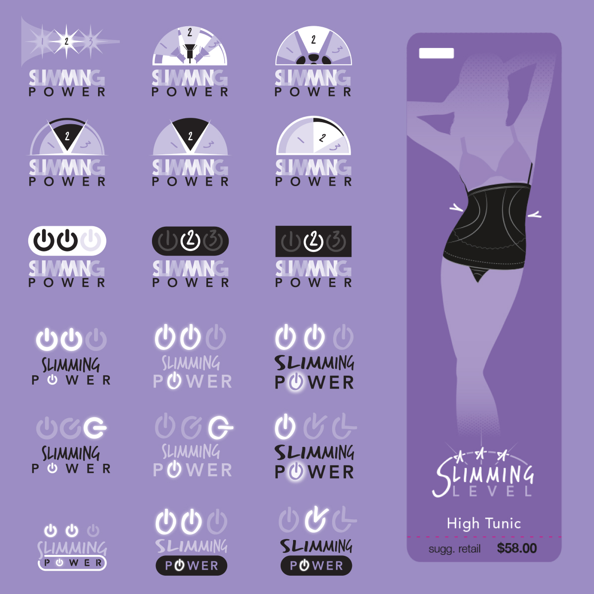
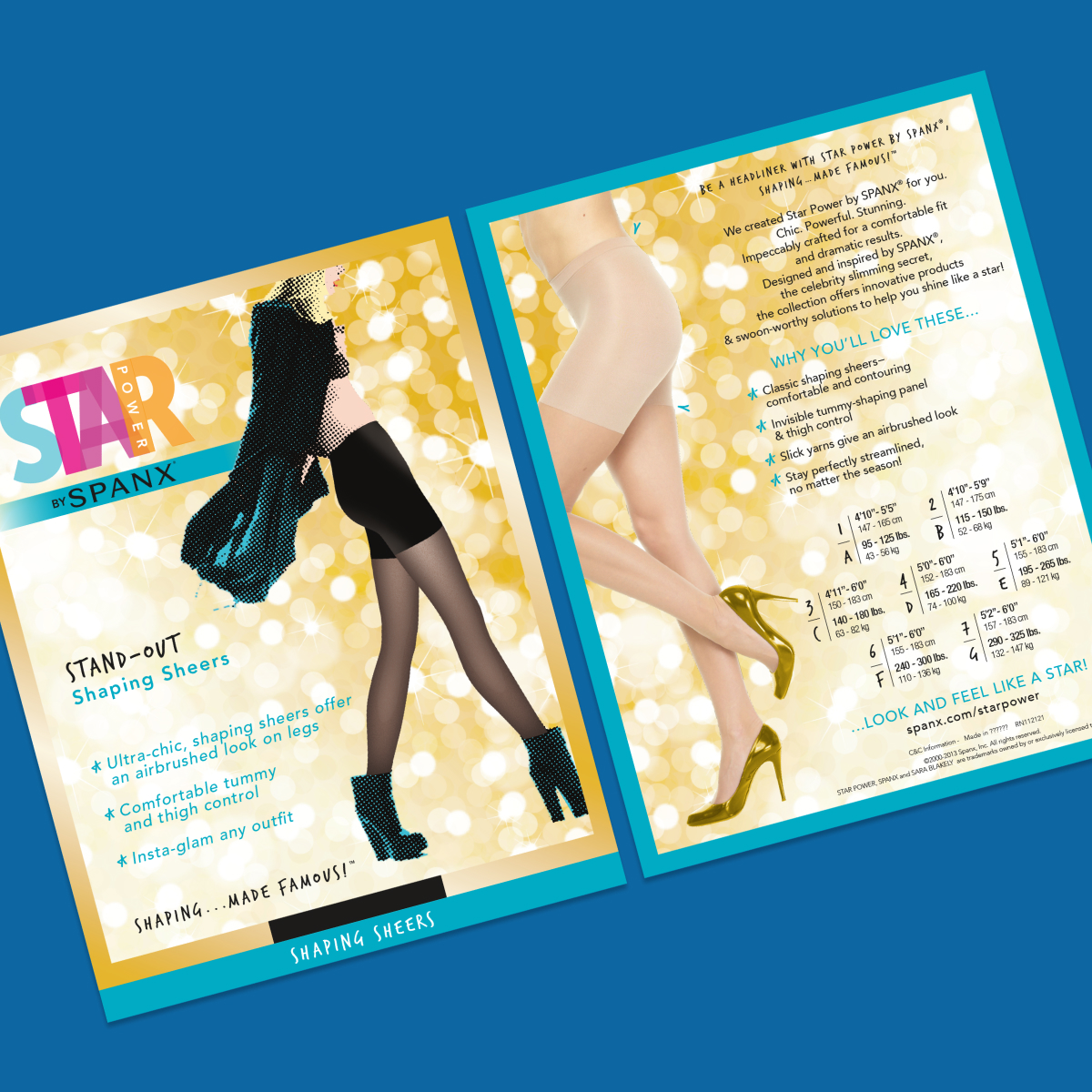
The “Slimming power” icon (the “how tight will this be” icon) went through probably the most rapid changes—including a name change to “Slimming Level.” Vincent had me do several (several too many in my opinion) versions of making it look like a computer power button. In addition to it being used to give a scale factor from one (gently slimming) to three (painted on), the carat marks I created were incorporated onto the hangtag illustrations to indicate where the garment was most fitted.
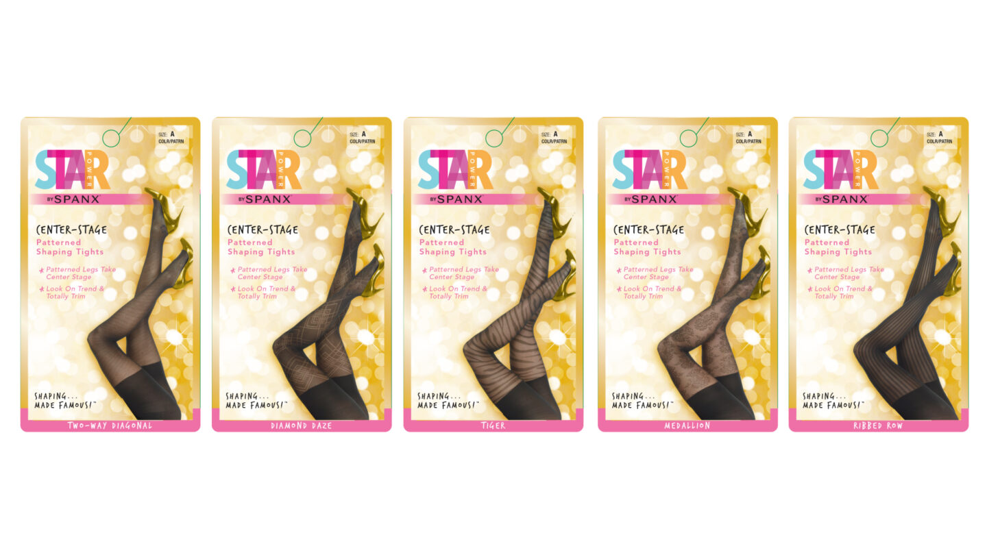
The leggings and tights packaging went through mostly edits involving the model placement. The first round of them I did was right after retouching had gotten the photos back to us and were mostly for determining copy placement.
An early die line development based on existing Spanx packaging.
Adding the Bombshell meant the key art on the package had to be (much) bigger to make sure her face would cut off correctly like all of the other packaging so only her red-lipped smile would show.
She also gained an arm along the way…
Additional fun: Should all the leggings be in the same pose, or should each one be unique and flirty?