CE Tech Branding & Design System

Contract work for The Home Depot via Aquent / Vitamin T | 2012

A New(ish) brand

While I was under contract with Aquent working for The Home Depot, there was a massive change to The Home Depot’s private label business. They were collapsing 52 private label brands down to only 18, which meant a number of their existing products would need to be repackaged under different labels.

CE Tech was a different case. It was still a fairly new brand when I came on board, having been made an extension of the Commercial Electric brand (what the “CE” originally stood for); and you’d think it would be one of the first of the many brands going onto the chopping block… but it not only made the cut, it was set to get a complete overhaul and product assortment expansion.

And I got put in charge of the brand overhaul.

There were very few products at the time in the original CE Tech packaging, so there was almost no brand equity in that look. For sake of argument I had to start with the existing logo for CE Tech (which clearly borrowed from Commercial Electric) and make it a completely unique brand that could encompass all of the new products that would fall under the new lineup.

The Brand Challenge

Look at the date when I did this work: 2012.

The first Amazon Alexa didn’t come out until 2014.

“Smart Homes,” “App-controlled home devices” or “Connected Homes” were still widely unknown in 2012. Maybe you knew someone who had a Nest thermostat or some (very expensive) HUE bulbs if they were super-techy, but that’s the extent of where most people’s IOT knowledge went at the time.

That meant it was a HUGE risk for The Home Depot to devote not one, but two bays in every store to a store-brand product line most people wouldn’t know they needed (yet).

The Design Challenge

As a new, private label brand, we had to keep the packaging costs as low as possible. Ideally, using only two inks unless it was for a more premium product.

The original CE Tech packaging was solid Cyan and Black on White stock, so I decided to keep those colors and push what could be done with gradients and screens of each to make them look more interesting than the original flat colors.

The Commercial Electric logo (top) that inspired the original CE Tech logo (bottom).
CE-Tech_600-601-Bays_2400x1007
The merchandised mock wall bays after we got the first round of dielines with art applied.

Brand Development: Clean Up

The original logo wasn’t going away quickly, so my first order of business was cleaning it up.

Most of the packages on shelves already were polybags with a cardboard header… and the CE Tech logo on the packages was TINY. Which meant the already-small “Commercial Electric” in the logo was unreadable.

So “Commercial Electric” had to go.

Then I had to convince everyone the logo would look better if all elements (the “CE Ball” and “TECH”) were vertically center-aligned.

(Yes, that was genuinely an argument we had)

Brand Development: Initial Exploration

Someone got the idea in their head that the “ball” from the original logo should stay… so I half-heartedly tried to make it work with some new fonts.

“CE” also started moving away from standing for “Commercial Electric” and became “Connected Experience” in all of our internal marketing materials.

Brand Development: Further Exploration & Focus Groups

At the same time the CE Tech brand was in development, the Glacier Bay brand was getting a complete facelift. Because of Glacier Bay’s inclusion of a “logo mark” icon, our team decided I should develop one for CE Tech.

I developed a LOT of them.

We narrowed it down to three and took those before a focus group to help us either hone in on a favorite or go completely back to the drawing board. The three favorites each used the Bank Gothic font in different weights and had slightly different icons separating “CE” and “TECH.”

My personal favorite icon combined the “C” and “E” like a computer power button fitted into a rounded-corner shape that resembled a phone app icon. The “C” in the Bank Gothic font has little indents that made a perfect space for the the center bar of the “E” to extend out into; and I loved the way that looked.

That was the focus group’s favorite as well.

By a LANDSLIDE.

Brand Development: Final Logo Development

Even though the focus group had already chosen the “app power button” version, I was requested to take that style and make ONE MORE PASS at additional “app-like” icons.

We went back to the one the focus groups liked best and that became the official CE Tech logo.

The Design System

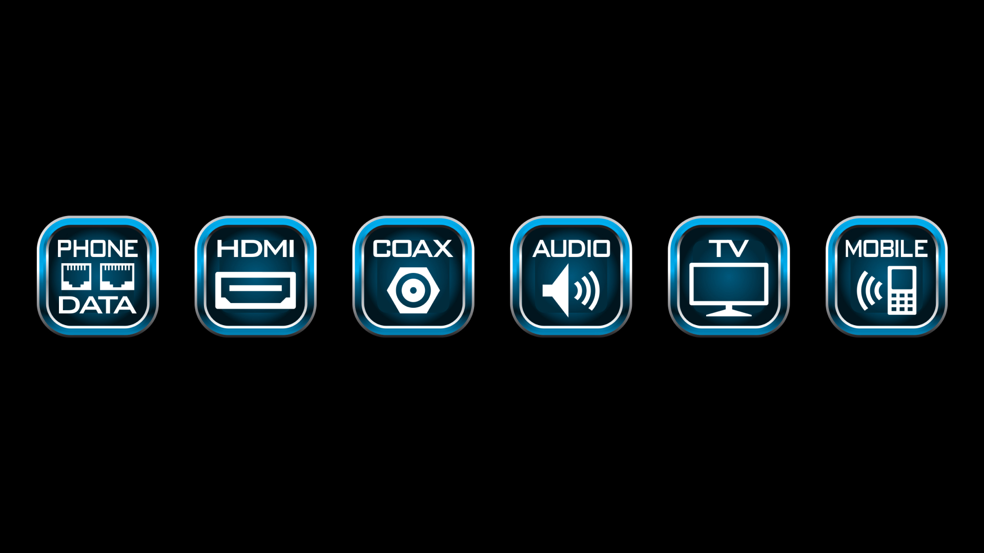
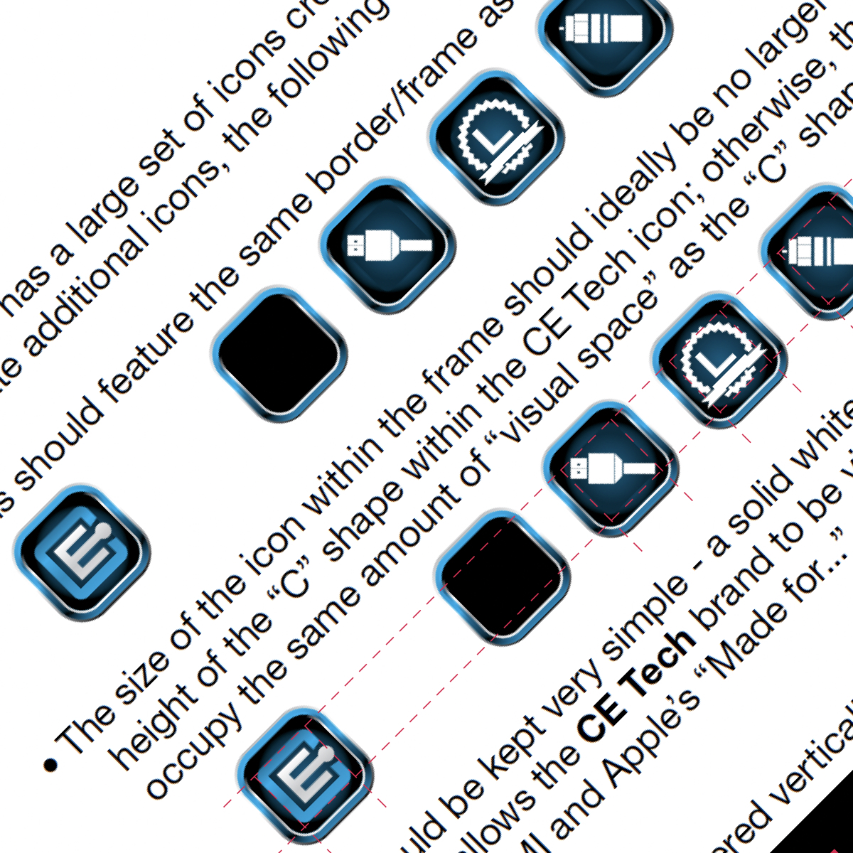
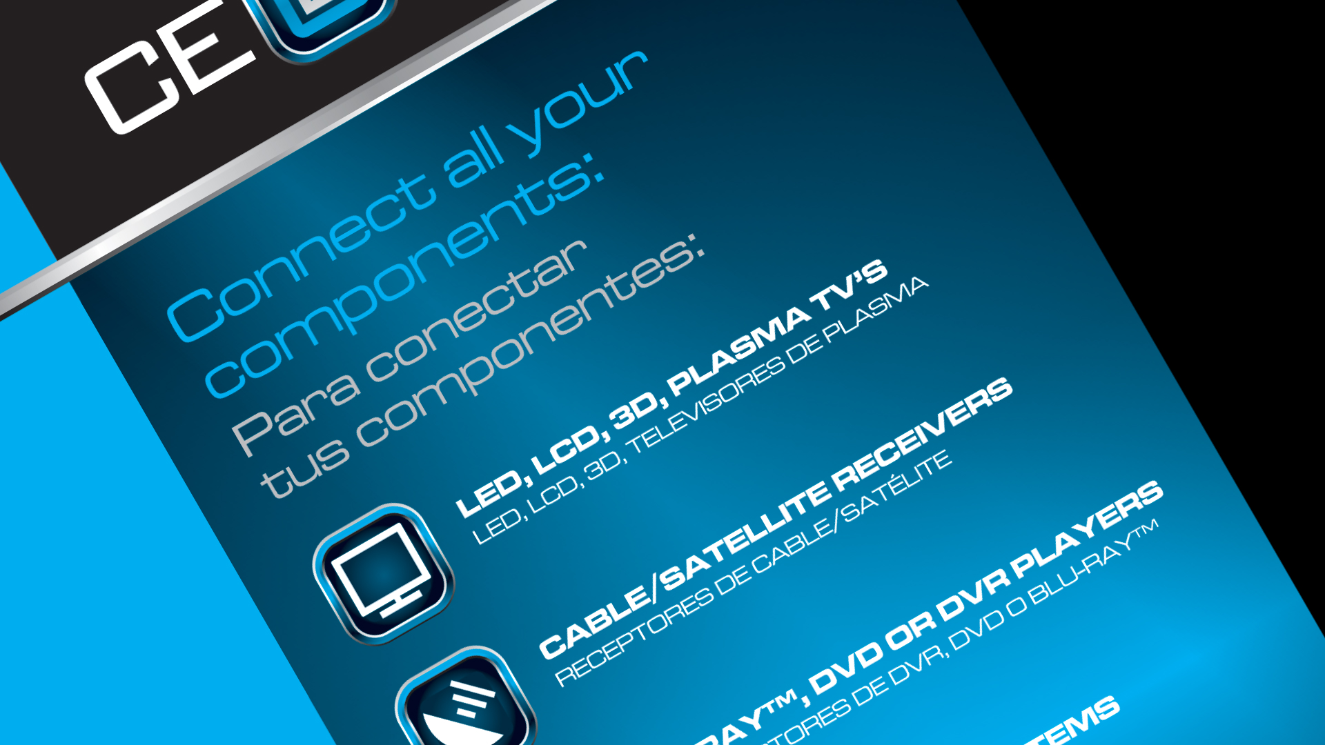
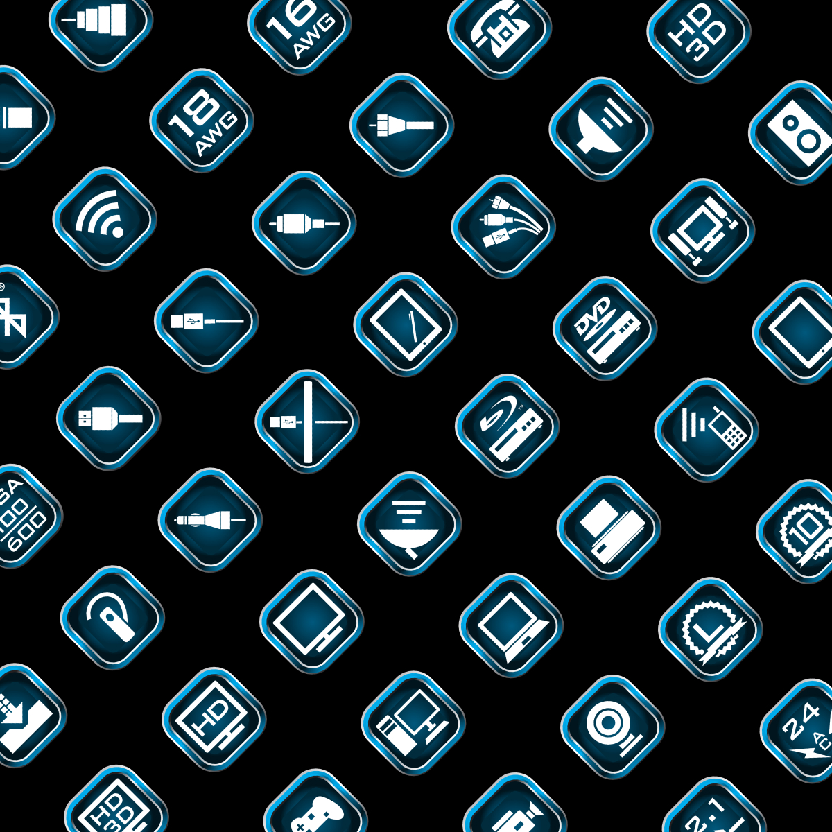
The next piece of brand devleopment was extending the icon set to fit the six main component groups the brand would launch with: Data Cables, HDMI Cables, COAX Cables, Sound Cables and Accessories, Computer Cables and Accessories, and Mobile Cables and Accessories.

The first set was close, but then we decided all six needed descriptor copy and “Data” should also include phone lines.

(Yes. It was 2012 and people still had land-line phones and dial-up internet service.)

Icons, Icons, Icons

CE Tech was a <very> icon-heavy brand. Explaining all the features of the technology meant a LOT of icons on the packaging.

Like.. over 100. 

And now… a packaging system.

It’s safe to say I’m a big nerd for design systems.

It’s essential when you’re designing as robust a system as CE Tech was going to be. Over 120 products at launch in 16 different types of packaging from polybags with hangtags to plastic clamshell cases.

I had to make such a tight system that any new products would automatically be able to be designed even if I wasn’t around to direct the look. I was on a limited-time contract, after all—so I could only take the work so far.

LS11.1-TBBW-REV-Wall-Plate-with-Diagrams
LS12-15.1-TB-REV-with-Diagrams

The First Four

Four products had to be designed almost six months ahead of the rest of the line because they were going to be special products for Black Friday.

And, of course, they couldn’t be easy products to package.

I had to make several sets of full-size mockups for in-house roadshows showing off the assortment.

Please excuse the really crappy photo… I usually had about a minute to shoot pitcures of all of them (with an iPhone 2!) before someone would come collect them all for the next roadshow.

The Branding & Packaging Guidelines

With the icons, fonts, Leader SKUs and Black Friday packages done, it was time to shift gears and get everything that was in my head down on paper. That meant incorporating all the legal and third-party branding guidelines (Apple, HDMI, x.v.Color, UL), too.

Like I said… being a nerd about design systems comes in handy.

The first draft was over 120 pages long.

The Team

  • Scott Hunt – Creative & Design Lead, Sr. Packaging Designer (Aquent / Vitamin T)