The Home Depot “Smart Home”
Design System & Brand Guide

Trade School Design Direction for The Home Depot | August/September 2024

The Home Depot went through a period of elevating several product categories via “surges,” where those categories would receive a slightly different design treatment that still felt very “Home Depot” but separated them from the core ad look. The categories we were asked to create custom templates for in 2024/2025 were Cleaning, Smart Home, and Bath.

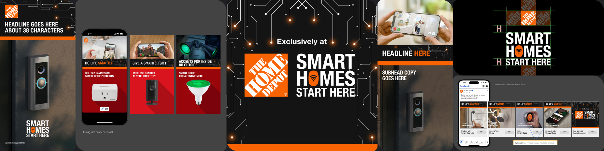
The creative considerations we were kicked off with:

  • Marketing is very interested in a visual stamp like a bug or other visual element that leans into our authority and stamp as the destination for every Smart Home
  • We like ‘Your Home for Smart Home’ as an ownable, branded destination but open to other ideas as well
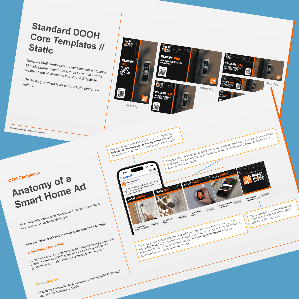
  • Messaging / visual identity and subsequent templates should be thought through for Social, OLA, digital video, DOOH, Rich, Audio channels
  • HM (Hispanic Market) messaging / visual identity should also considered as we are seeing HM audiences bought for other Brand Surge initiatives like Cleaning

Unlike Cleaning, Smart Home was going to start with the templates, design system, and toolkit – and a custom video shoot would follow in early 2025.

The Smart Home surge’s key objective was to remind people they didn’t need to order Smart products online; they could come get them at The Home Depot. Cleaning was all product awareness because most people didn’t know what a wide range of cleaning products The Home Depot carries. The Bath surge was about inspiration. 

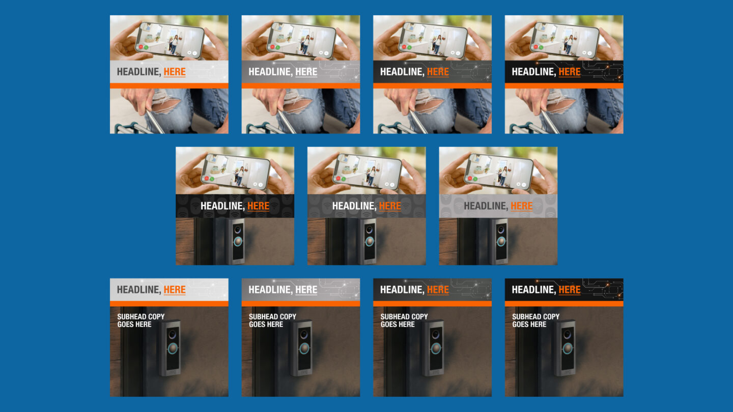
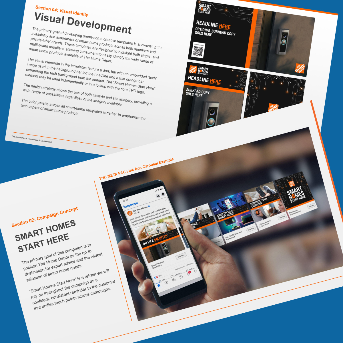
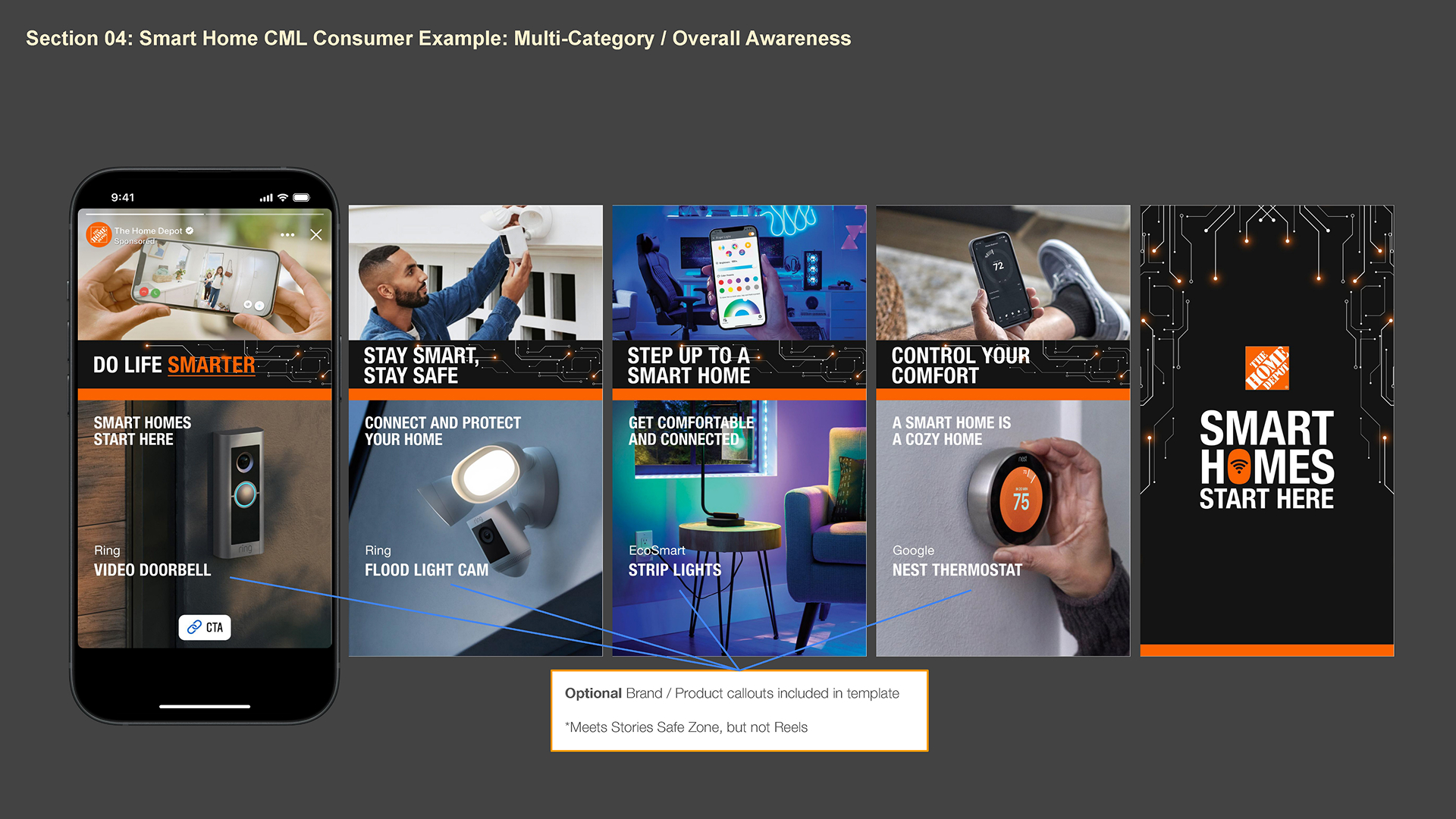
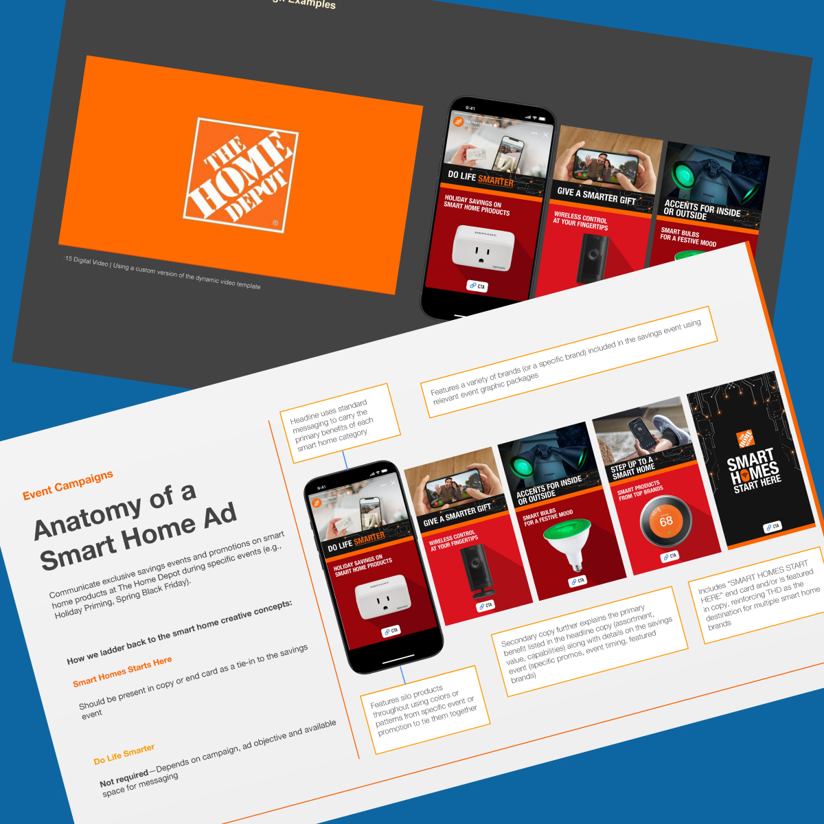
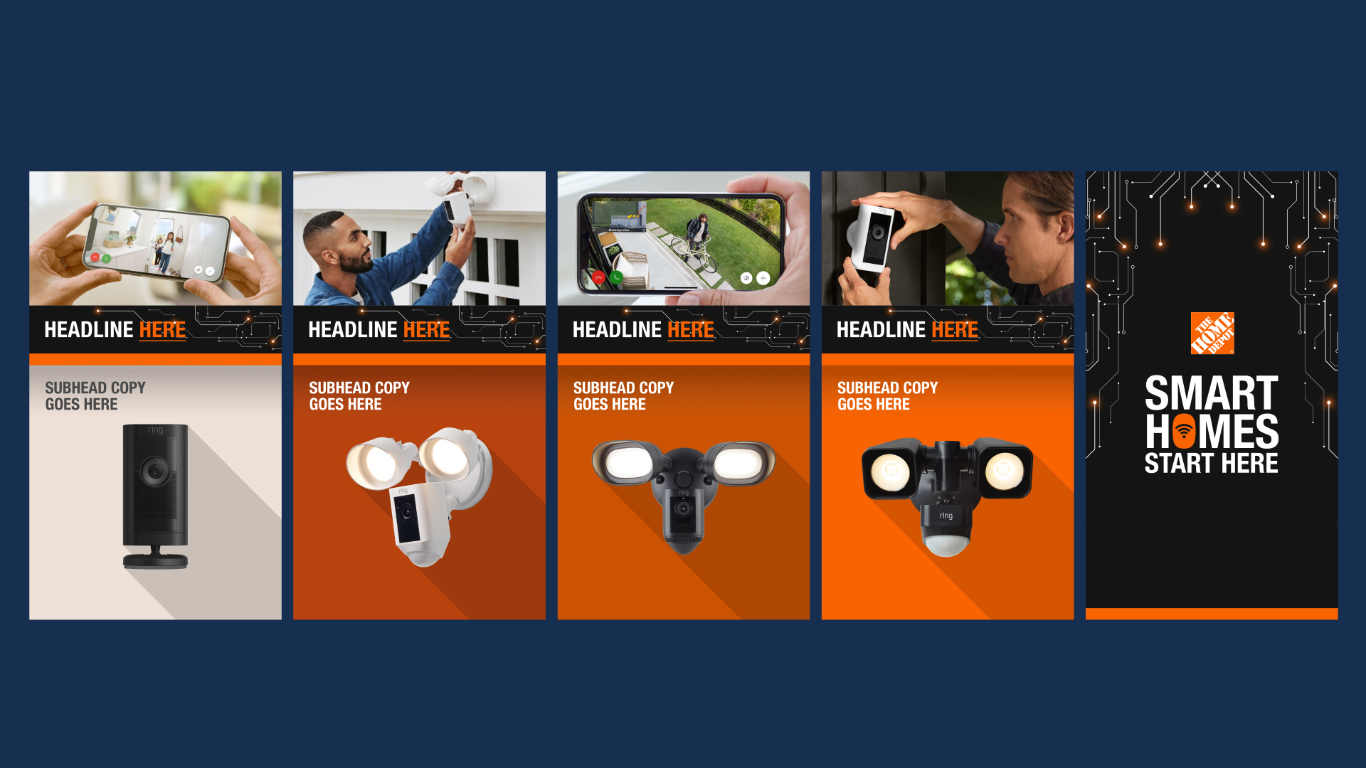
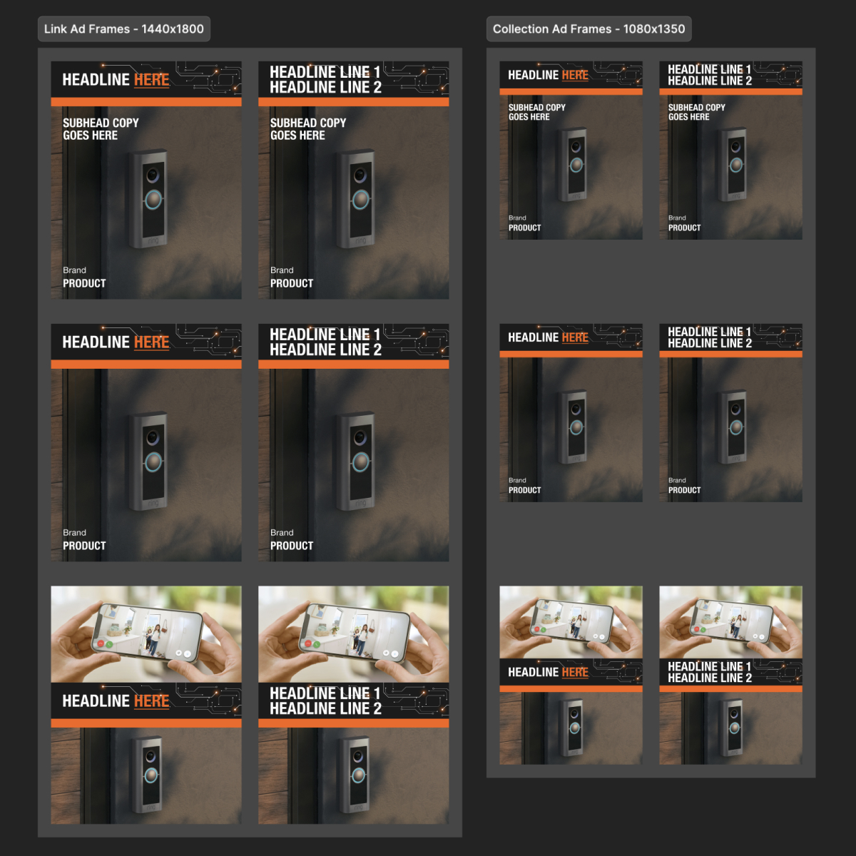
Our biggest challenge developing this system was a way to show lifestyle alongside silo product images. Where we landed gave The Home Depot a flexible system with guardrails to keep any of the units from looking “junky.” For example, a carousel that used the silo treatment had to use it on every frame – there was no alternating between silo and lifestyle images. It was very much a “pick a lane and stay in it” concept.

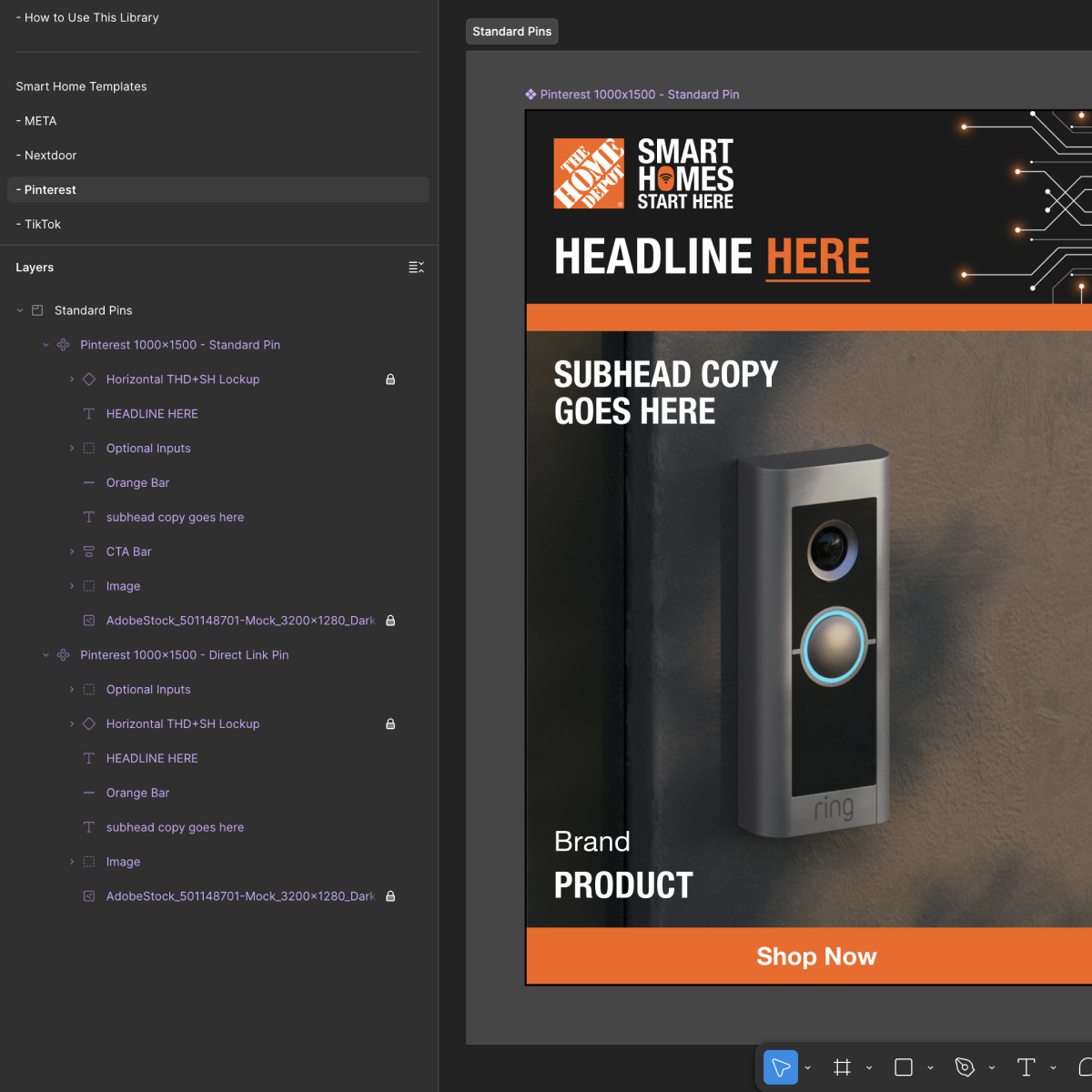
And like all the other surges, the toolkit was a sales enablement tool. In our “Creative Examples” section, we built out full units of all Google products, all Ring products, all Wyze products, etc., so the Orange Apron Media (OAM) team could more easily sell those placements.

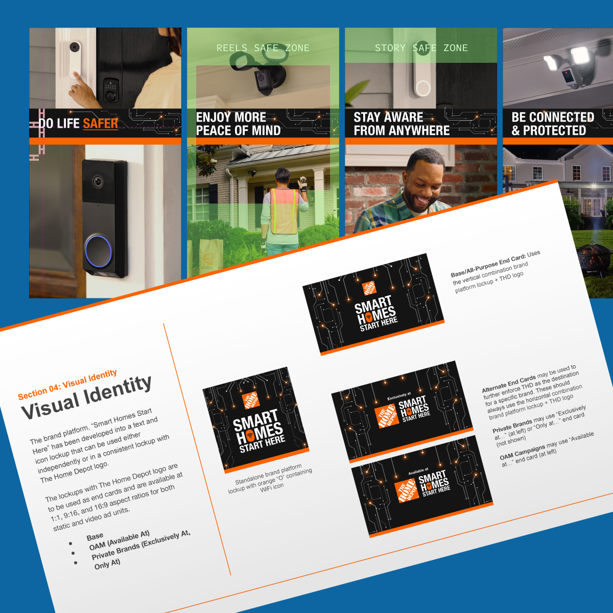
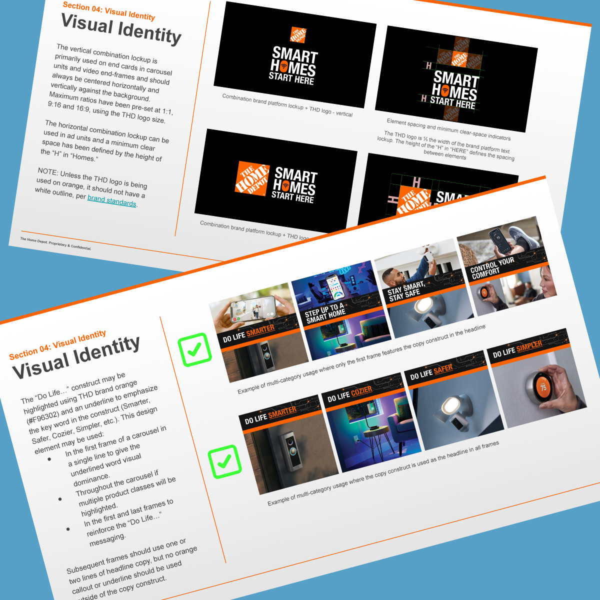
The branding and end card went through the most changes during development. Above is the original “logo bug” we were given at kickoff. The Home Depot LOVES to include the word “home” in taglines to reinforce their brand name.

Unfortunately, “YOUR HOME FOR” above “SMART HOME” turned into pixel mush very quickly at smaller ad sizes. It worked great in ads that were at least 1080×1080, but those 300×50 mobile display banner ads? Illegible mush.

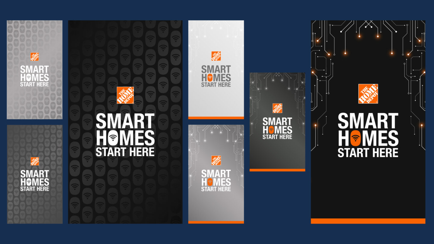
We presented several variations and landed on “SMART HOMES START HERE.”

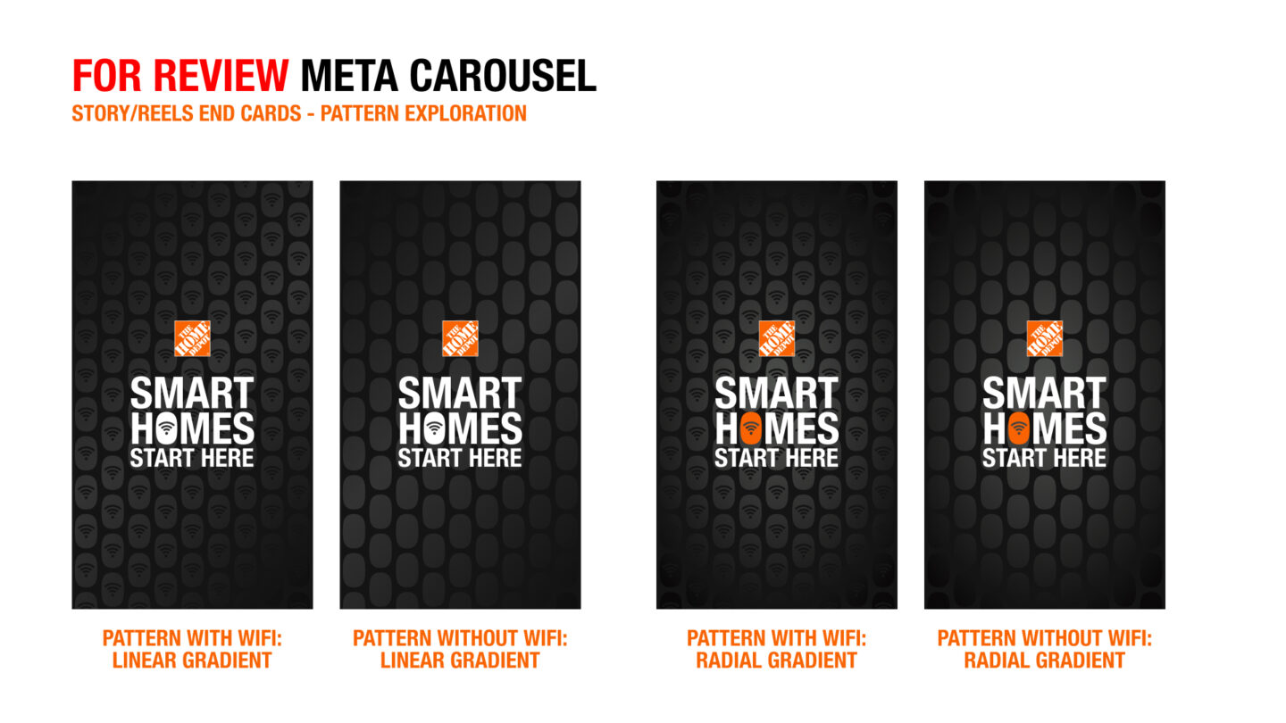
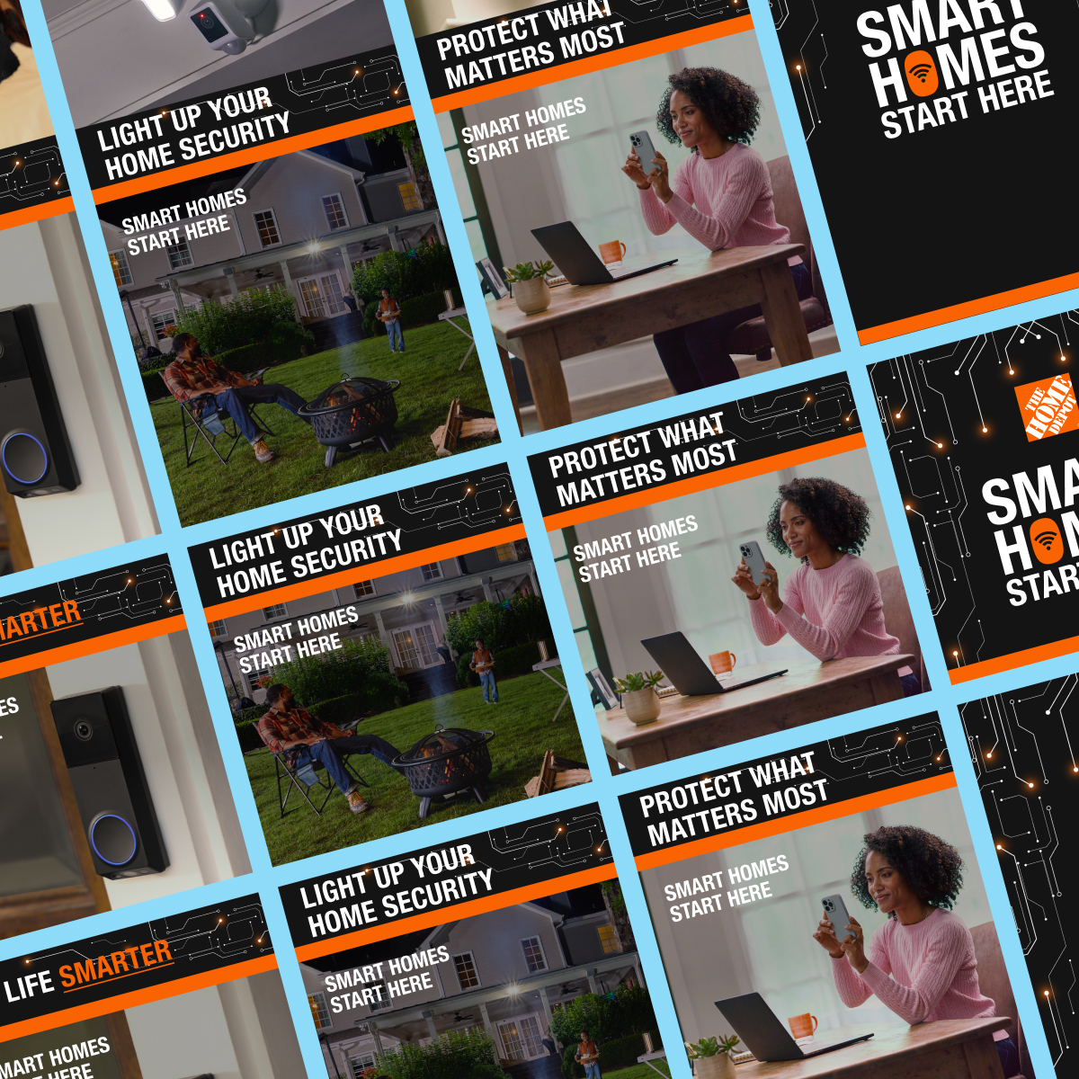
There were several patterns that were also auditioned at different points, including one we nicknamed “carbon fiber” that the clients liked so much, they had us try a version with the “O” shape becoming the WiFi symbol in the background.

“Add more orange” is something we hear all the time—especially from the OAM team.

We even tried all-orange variations of the carbon fiber pattern for the OAM team (which were… intense) and settled on a thin orange bar on every ad instead when the circuit board pattern was selected.

More pattern and color variations (thank goodness you can rapidly protoype in Figma) as we were trying to nail it down between the carbon fiber pattern and the new circuit board element.

The Team

Trade School

The Home Depot

Position The Home Depot as the go-to destination for Smart Home brands & products 

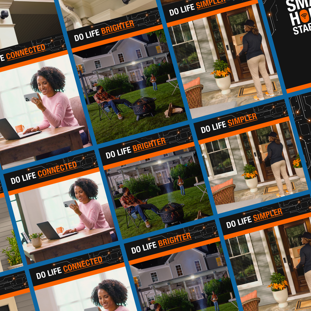
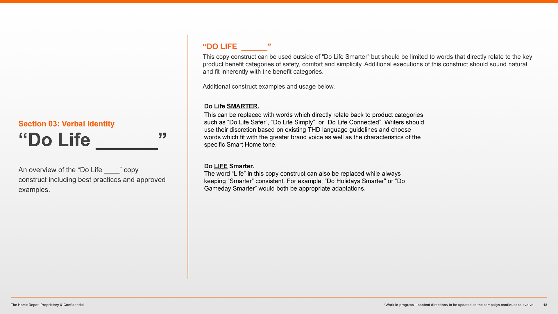
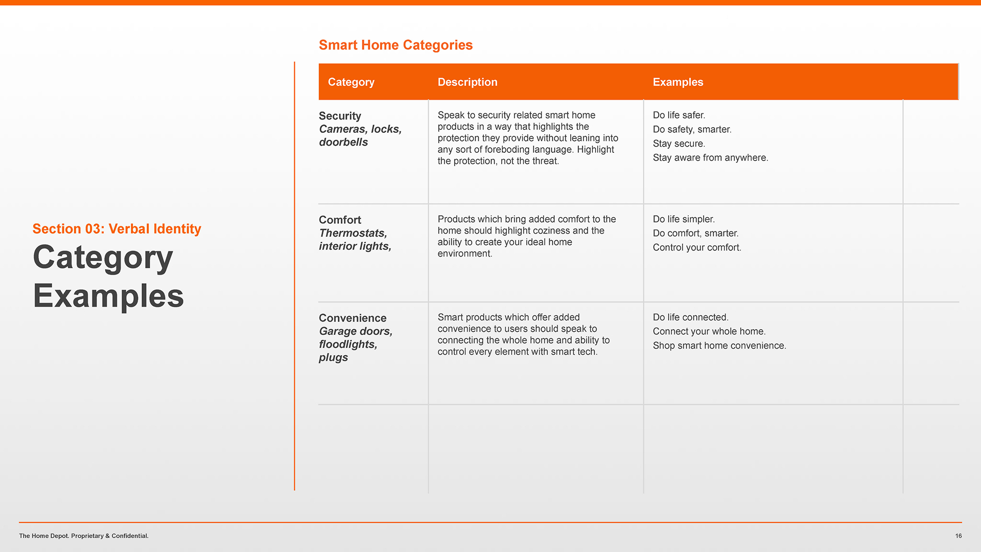
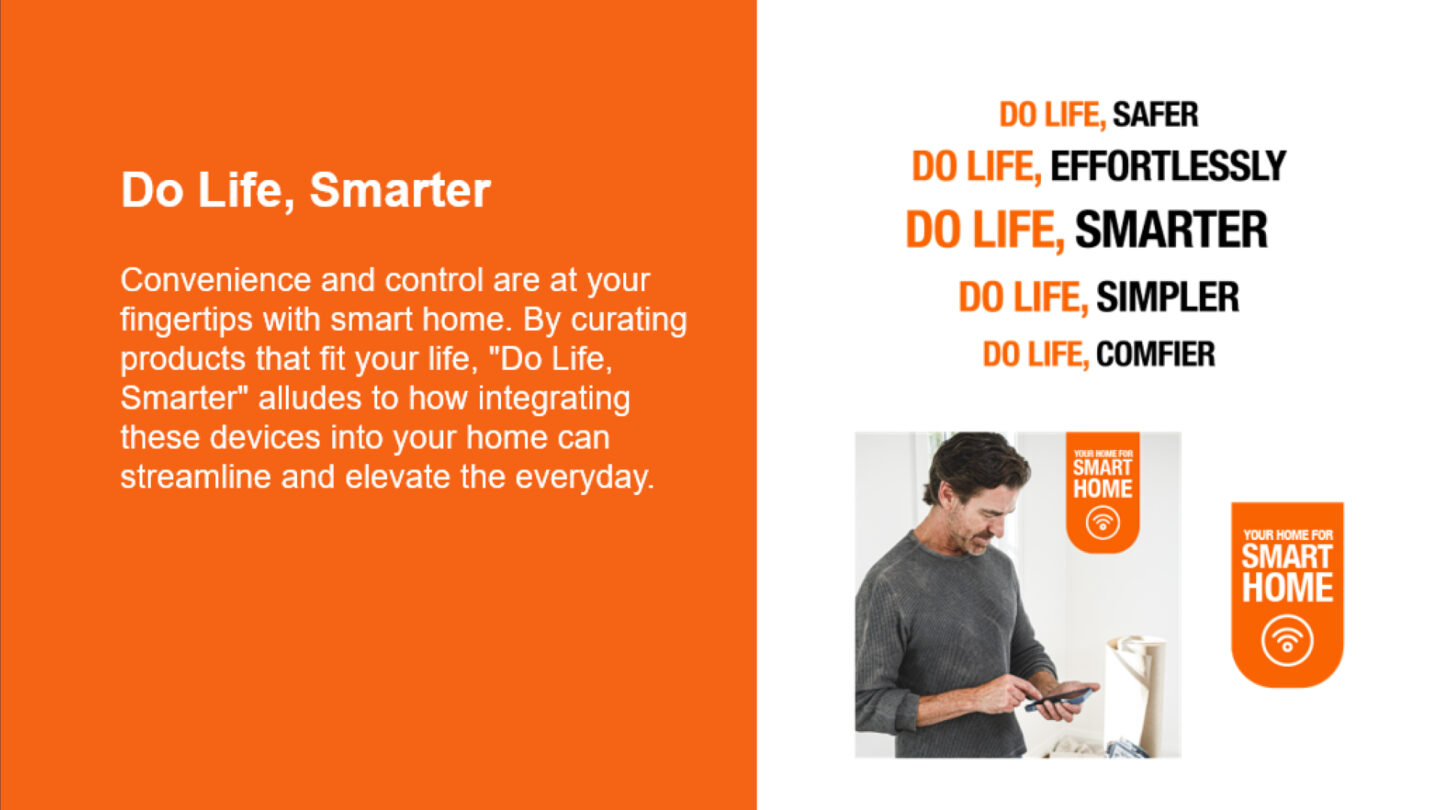
The phrase “Do life, smarter” and its variations (“Do life, safer,” “Do life, effortlessly,” “Do life, simpler,” and “Do life, comfier”) came to us in the brief, as did the original tagline, “Your home for smart home.”

As anyone who’s ever tried to use a tight copy construct knows, it works in limited uses only. We quickly identified just how limited it was when Brandon started making the Copy matrix that would accompany the toolkit. The more ways he tried to make the client-provided construct work to fit the template needs, the more ways it started breaking down. There were also categories that didn’t really fit into the construct framework, so we defined its limited use and then broke away from it.

Eventually, we abandoned the comma in the headlines, too.

The design system had to be flexible enough to support supplier-sponsored ads for the Orange Apron Media (OAM) team, while also featuring a color palette that would work with The Home Depot’s Tier 1 and Tier 2 sales events.