Food Styling & Product Photography
In-House Creative for Dippin’ Dots Ice Cream | 2005-2011
All of my food styling—aside from a couple of times my husband has asked me to help with photos for his vintage food blog—has been for either Dippin’ Dots Ice Cream or Arby’s Restaurant Group. I was in-house with Dippin’ Dots for over six years (April of 2005 until October of 2011) and I worked on Arby’s social media as part of both ROAR Groupe and Moxie for more than four years (September 2016 until February 2021).
The central photo above is one of the many, many flavor profile shots I did when I started with Dippin’ Dots. Over time, we shifted to less “explanatory” flavor profile photos; so I wasn’t shooting as many of these by the time I left the company… which was good, too. Dippin’ Dots is based out of Paducah, KY, and at the time, my options for finding produce for shots like the Rainbow Ice flavor were limited to Walmart and Kroger… and depending on the time of year, it wasn’t pretty. I remember having to buy several flats of raspberries for the above shot to find the ten good ones we used because they were out of season.
In addition to styling all the food at Dippin’ Dots, I was then the one who had to go back to the office and prepare it for use—I became the resident “Photoshop Guru” as I meticulously color-adjusted and cut out every shot. I take it as a compliment that a decade later, they’re still using all of the individual flavor photos I took and retouched—the only ones on their site that aren’t mine are the flavors that have come out since I left.
Every food stylist will tell you that ice cream is a pain in the butt to work with. Dippin’ Dots presented its own unique set of challenges:
My solves for both of these:
Oh yeah… because they were made in liquid nitrogen and stored at -40˚ to keep their shape, we had to transport them from the office to the photography studio on dry ice. All that siad, I was very used to wearing PPE around the office either on “Lab Dot-making days” or shoot days. Getting liquid nitrogen out of a ginormous tank in a production facility is actually kinda scary.
Then there was Dots ‘n Cream… traditional ice cream with standard Dippin’ Dots injected during the freezing process. This made the traditional ice cream super smooth compared to most retail brands.
It did NOT photograph well.
The percent butter fat content was SO HIGH in the traditional ice cream it started melting almost as soon as it was scooped.
My solve for shooting it was:Easily 90% of the scoops were mashed potatoes. For what we needed, they worked and looked just like the original product.
Thankfully, I was able to take a lot of the on-the-job tricks I’d learned from Dippin’ Dots and bring them forward when I started working on Arby’s.
Creative Director, Art Director, Food Stylist, Retoucher, POP Designer, Copywriter
(the joys of being on an in-house team)
Make it fun and futuristic.
I’ve kept this work off my portfolio for years, because every time I’d put it up, I’d get a cease and desist from the lawyers at Dippin’ Dots for “giving away how it was done.”
Apparently, they don’t want anyone to know that Dots ‘n Cream was dyed potato flakes with balls of Play-Doh mixed in…
Individual Cup Shots of All Flavors
2006-2011
Imagine having 30+ flavors of ice cream, flavored ice, sherbet and frozen yogurt… and having to make “Lab” versions of all of them. That could have easily been my full-time job for a month; but because there was always so much to do, making and re-shooting every flavor took over a year. With LTO (Limited Time Only) flavors factored in, we usually shot 8-10 new flavors or flavor combinations a year.
Overhead Cup Shots of All Flavors
2007-2011
This idea came from several theme parks and stadiums starting to use their own custom cups versus the Dippin’ Dots-branded cups. Rather than shooting unique product shots for every menu at every venue, the overhead shots showed the flavor without showing the cups—and they had to be PERFECT.
These became the standard used on every menu starting in 2009 and are still in use today.
Dot Cakes
2008
My husband and I watch a lot of cooking shows.
Like, A LOT.
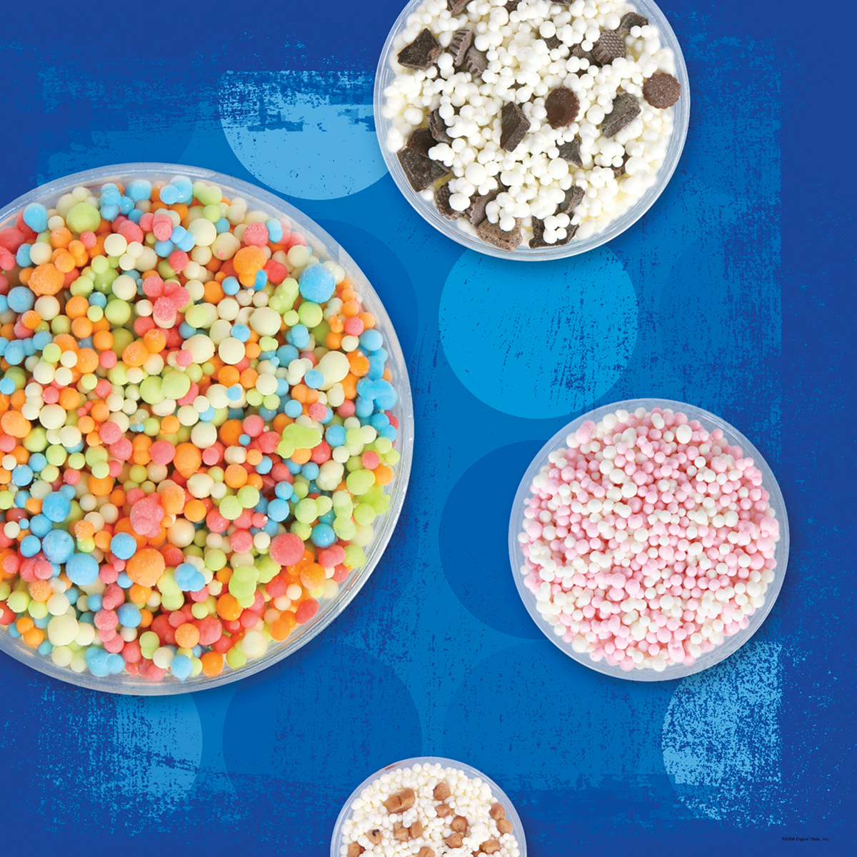
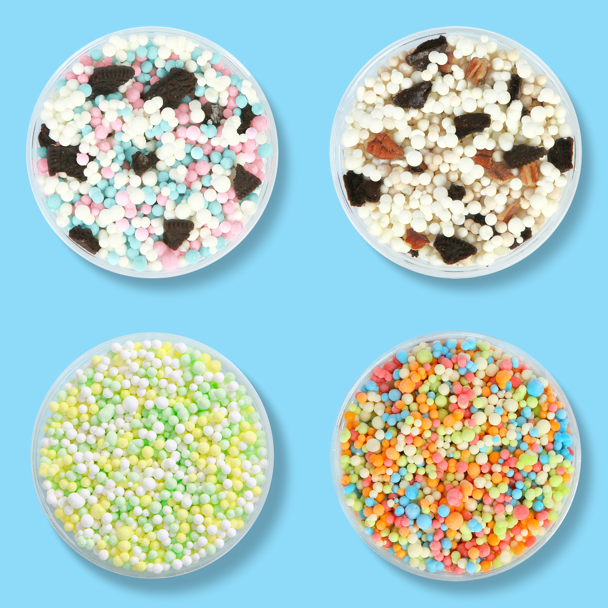
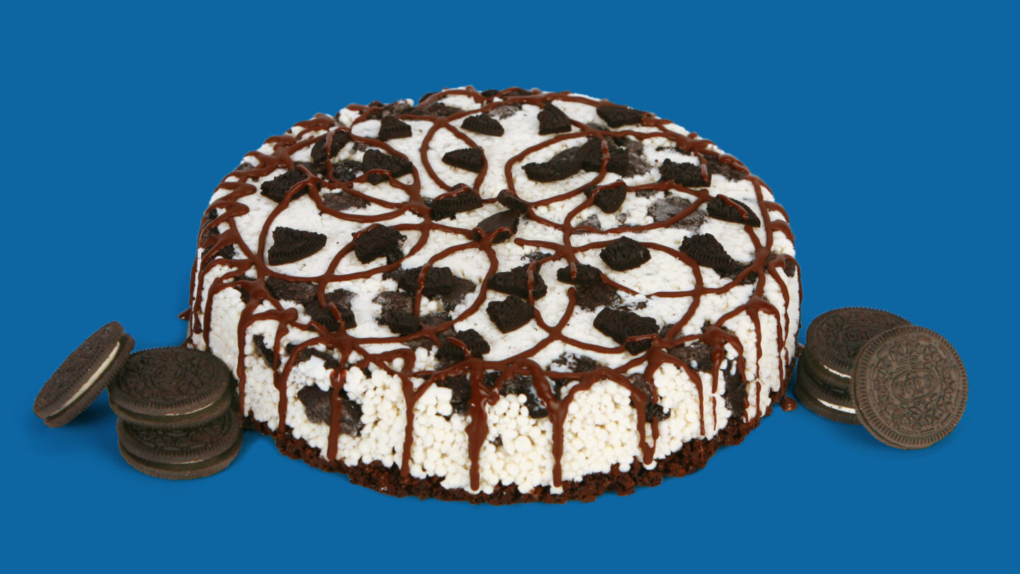
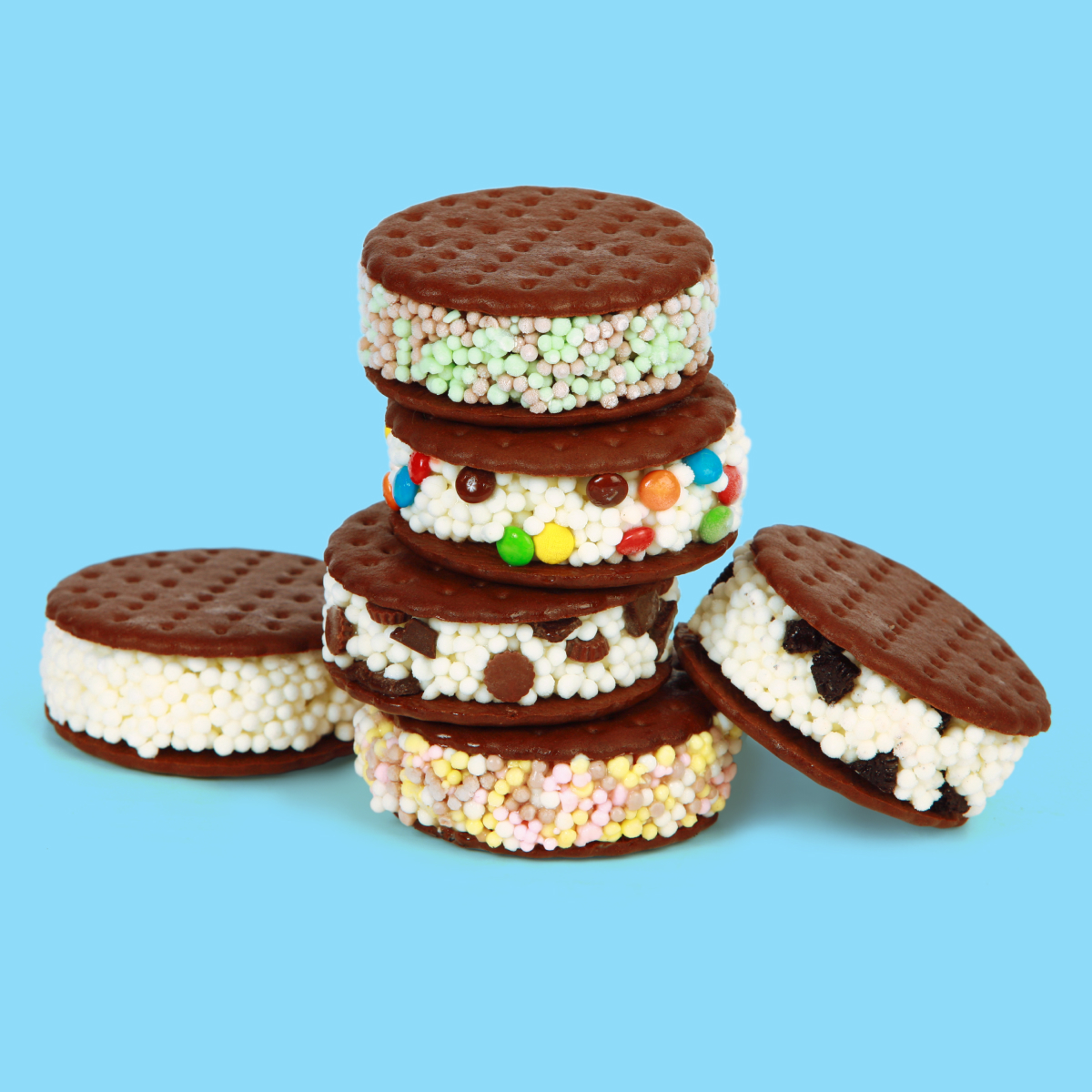
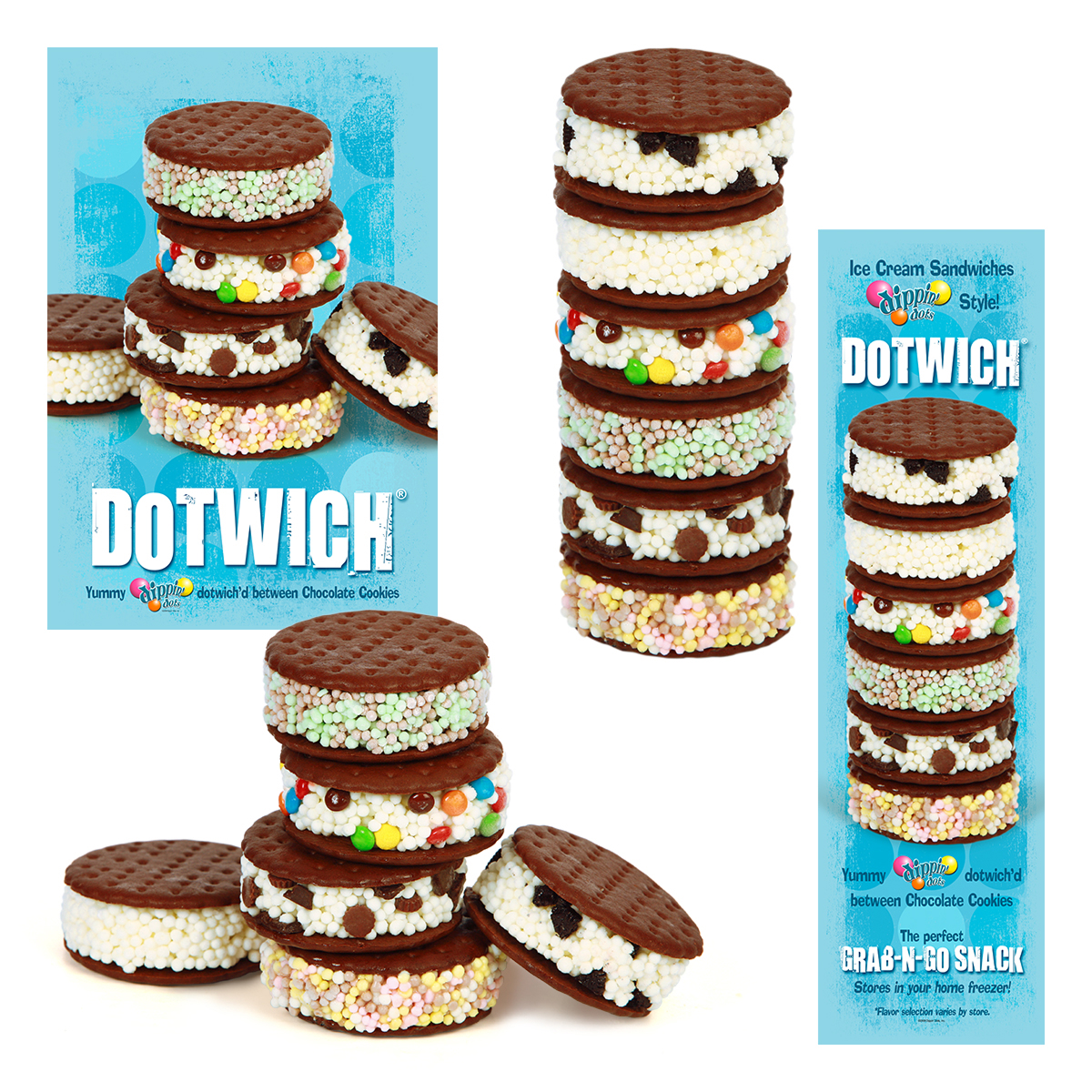
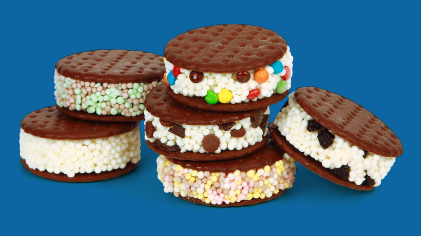
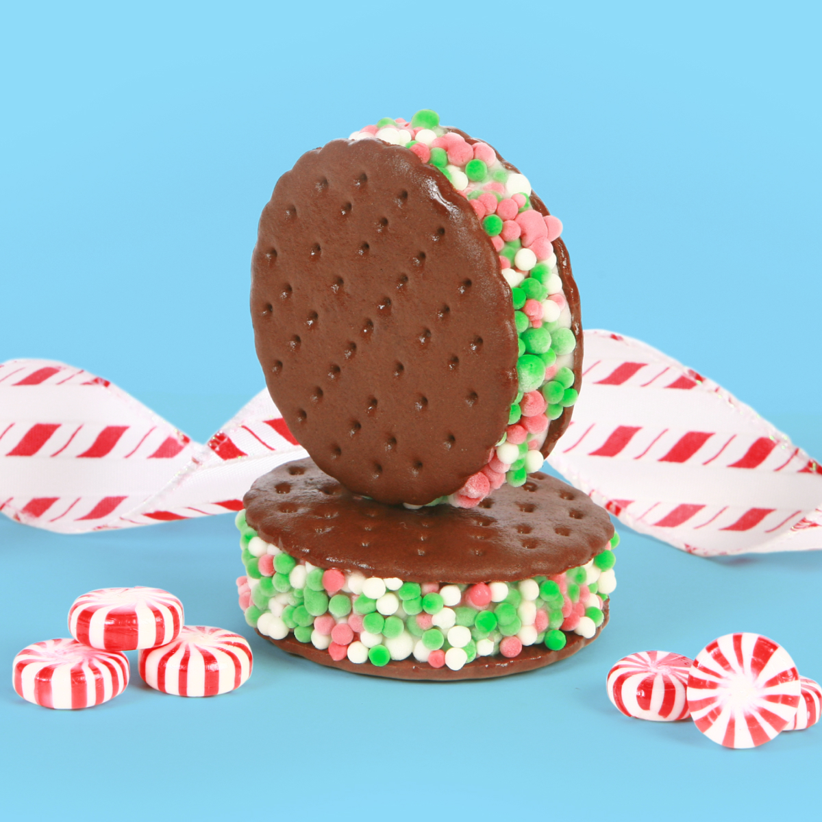
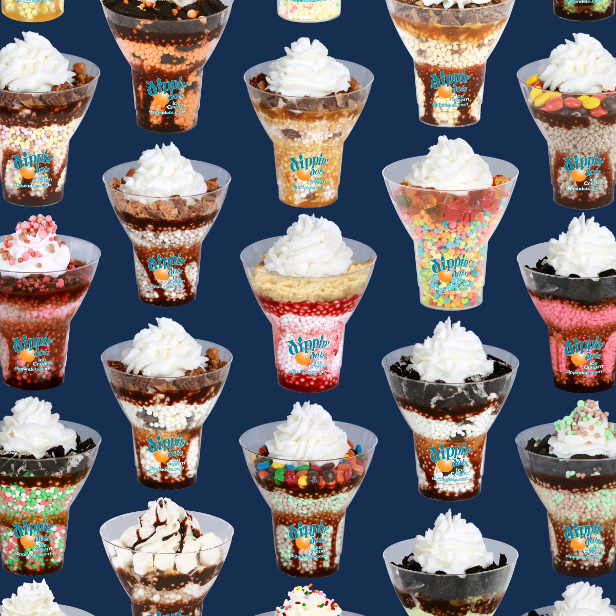
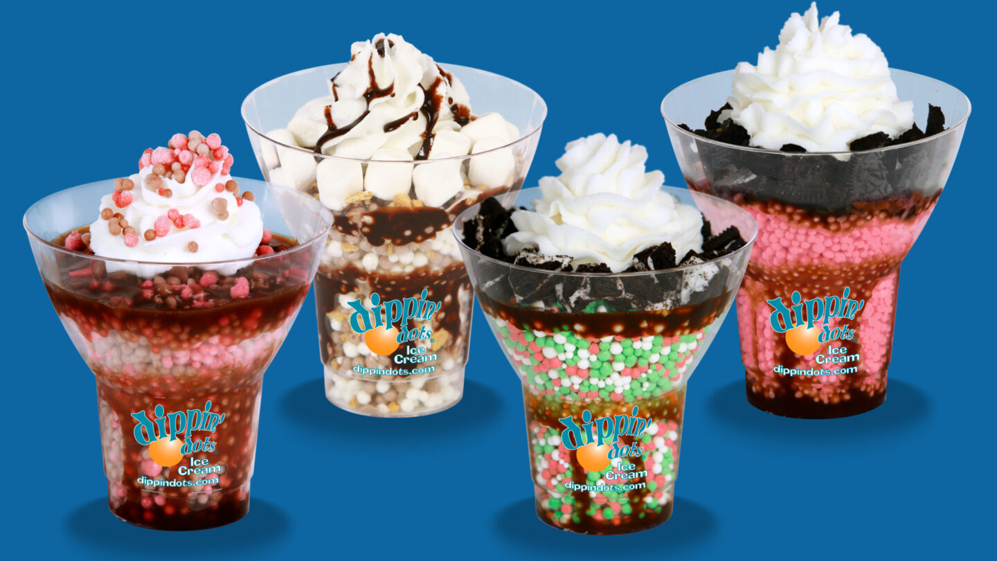
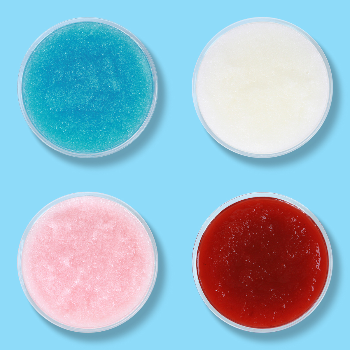
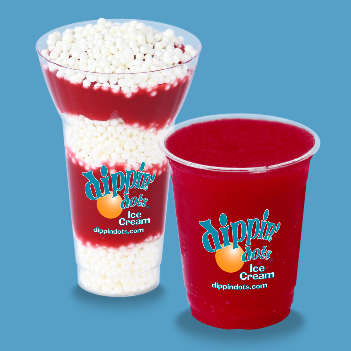
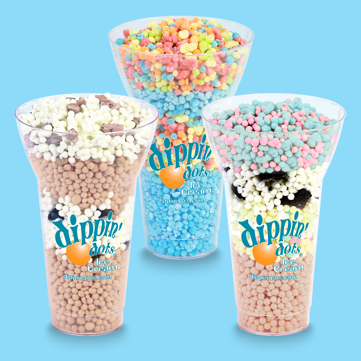
So I know how important good technique and plating are to make food look appealing. Sometimes, it’s a bigger challenge than others. Dot Cakes were relaunched in 2008, and it was my job to make them look pretty.
It took a lot of takes. Gordon Ramsay would have had my head for the amount of wasted food.
A finished Dot Cake before slicing.
The Birthday Cake-flavored Dot Cakje image was supposed to be a one-off for Dippin’ Dots’ 20th anniversary, but it ended up being used a LOT because of how colorfully I’d dressed the set that day. This bright, striped background became a signature image for all the franchisees with brick-and-mortar locations who had party rooms.
And yes: I made the white-cake-plus-yellow-cake cupcakes with buttercream icing for this shoot to match the ice cream’s flavor profile.
This shot got a lot of franchisees REALLY annoyed with me. Dot Cakes were easy enough to make, but decoration came after you pulled the cake out of the mold after letting it set up overnight… and I got many, many angry emails that my handwriting in icing was too good and they’d never be able to reproduce it on-site.
Dotwich Program Relaunch
2008
This is an example of how I would do different arrangements of foods to fulfill the end use. Shown with the two configurations of Dotwiches are a 24×36 menu graphic for an inline store and the 7×24 graphic that fits into the POP Triangle.
The cookie wafers had to be replaced between shots because they would start fusing to each other.
I shot a more horizontal version while I had the product ready because we’d often show Dotwiches and Dot Cakes together, so this gave us more flexibility.
Only once did we get asked to promote a seasonal Dotwich flavor (using the Candy Cane Ice Cream only available in November/December). Most of the time, we were asked to photograph and develop POP materials for Shakes or Sundaes because they didn’t require being made ahead.
Clusterz
2009-2010
Clusterz were a new product Dippin’ Dots was testing at several locations that involved Magic Shell being used to fuse Dots and toppings from the Sundae program together. They looked a lot like Cracker Jack bits. Unfortunately, the actual product didn’t hold up to being shot in-studio, so Clusterz were made out of polymer clay balls I baked then dipped (carefully) in flock to give them the frozen look of Dippin’ Dots. The “chocolate” is puffy paint.
The Mini M&M’s are real, though!
Dot Sundaes
2007-2011
We released a core set of seven Signature Sundaes when the program launched system-wide for all franchisees in 2007, and then released a new Dot Sundae with every Limited Time Flavor. Obviously, this is only a sampling of the many flavors and combinations I had to style and shoot. One of my favorites was the Candy Cane Sundae (shown at the top of the pyramid) we made using the Candy Cane ice cream flavor that came out every December. That mixed with Ghirardelli Chocolate Sauce was… so good it was stupid.
I’ll be real here: the Yummy Gummy Signature Sundae using Rainbow Ice Dippin’ Dots and mini Gummi Bears always grossed me out. Kids loved it, but I couldn’t get past crunchy, frozen Gummi Bears.
So. Many. Sundaes.
Every new LTO period included a special Sundae offering.
The four ice cream flavors that came back year after year brought their signature Sundaes back as well: Chocolate Covered Cherry (for February/Valentine’s Day), S’Mores (for Fall/Back to School), and Candy Cane and Peppermint (for December/Christmas).
These were some of the more colorful flavors, and I looked forward to seeing them back every year. A lot of our always-on Sundaes were… very brown.
Dot Floats
2008-2010
Dot Floats were being tested at the same time as Dot Sundaes, but the Sundae program was able to launch faster. Which meant that I had more time to shoot (and re-shoot) the Dot Floats. The core Floats that most franchisees or the larger theme park Sundae Shops we launched were either Coca-Cola or Root Beer with Vanilla Dippin’ Dots or Orange Fanta and Vanilla Dippin’ Dots. We came up with a wide assortment of flavors (not all pictured here) that used the most common flavors most franchisees would carry. Liberty Ice Dippin’ Dots mixed with Sprite (third from the left) was surprisingly good.
The major trick to styling and photographing these was having just the right amount of pop in the cup to start with and getting all of the Dots put in at once versus “pouring” them in slowly. That achieved just the right amount of visible pop, froth, and ice cream. Pouring the Dots in slowly made a lot of murky mush.
Not gonna lie, a lot of these Float flavors were clearly aimed at a child’s palate… I’m not sure who else would mix Vanilla Ice Cream and Mountain Dew together…
Dot Quakes
2009
Sundae Program + Milkshake Cups + Spindle Blender = the Dippin’ Dots version of the DQ Blizzard.
I did shoot the first few of these with actual Ghirardelli sauce, but the Suace would inevitably bleed into the Quake within minutes of mixing it up. Because of the way we wanted the sauce drizzle to show in the cups, I ended up making a special blend of acrylic paint and gloss medium and “painting” it on with a squeeze bottle the night before each shoot. Kept the translucence of the Sauces but stayed in place and didn’t bleed.
The original Dot Quake lineup, using the Sundae toppings and sauce ingredients paired with the most common ice cream flavors carried by franchisees, making program adoption easier.
I think it’s important that I nerd out for a second here. Smart Objects were still a fairly new thing, and I used them to their fullest whenever we shot and edited new products so we could easily swap out any images on a menu board and not have to worry about resizing everything. It made me quite the stickler about shot angles from shoot-to-shoot and final file sizes in pixels for storing on our DAM.
Solar Freeze Program Relaunch
2009
Wait… is that Solar Freeze Parfait in a Dot Float cup? One of the things I learned working with a franchise system was the many ways we could use and reuse cups and equipment the locations already had to maximize their investment (and sales).
Solar Freeze was essentially a slushie mix, and it behaved very differently than the pop used in Dot Floats when Dots were poured into it.
The final flavor lineup for brick-and-mortar stores included Blue Raspberry, Piña Colada, Pink Lemonade and Strawberry. I shot all of them from above because we worked them into the Sundae Shop wallpaper design for the larger theme parks as well.
Any time a program would re-launch, there would be a testing period with a select group of franchisees to determine what made the final lineup. When the Solar Freeze test program went live, we started with six flavors with the intention of narrowing it down to four. Since Orange and Cherry were the least popular, they were ultimately cut – but I still had to shoot them for the test!
The Strawberry flavor featured an all-natural strawberry puree and some of the DARKEST red food coloring I’ve ever seen. It made putting the Strawberry and Blue Raspberry next to each other on the POP a very striking contrast.
LOL (Lots-O-Layers)
2010
It’s not actually Cotton Candy Dippin’ Dots in the photo on the right; it’s Mint Chocolate. The Green Mint Dots became blue and the Chocolate Dots became pink. Inevitably after I shot ANYTHING we’d have a custom request come in asking for different flavors. Lots-O-Layers was yet another way we could reuse cups brought in for a different program, so I shot five different set of layers that ended up generating over 20 different customized shots.
The first batch of Lots-O-Layers we shot used my Lab Dots… and then the Chillz Ice Flavors (Wango Rainbo and Sour Blue Razz) were thrown into the mix, and those had to be shot with production line Dots. There is a noticeable difference because there are many broken Dots in that cup shot.
Dots ‘n Cream Scoops on Cones
2008-2009
Yes, it’s balls of Play Doh mixed in potato flakes dyed with food coloring.
Can you tell Berry Créme and Mint Chocolate are the same shot, recolored? This is what happens when a new flavor is ready to launch and the Marketing Department isn’t given ANY notice.
Dots ‘n Cream Scoops with Garnish
2008-2009
One of my absolute favorite ingredients to work with was the Vanilla Bean pods from our Vanilla flavoring supplier. They would hand me bundles of 25-30 of them any time I said the ones I’d been using were starting to dry out.
All of these “flavor profile” scoop shots were meant to be used on the POP for the individual Dots ‘n Cream flavor pints… and they were each used exactly once on the Dots ‘n Cream website (which I was given four hours to build).