The Home Depot “Dream Baths”
Design System & Brand Guide

Trade School Design Direction for The Home Depot | June 2025

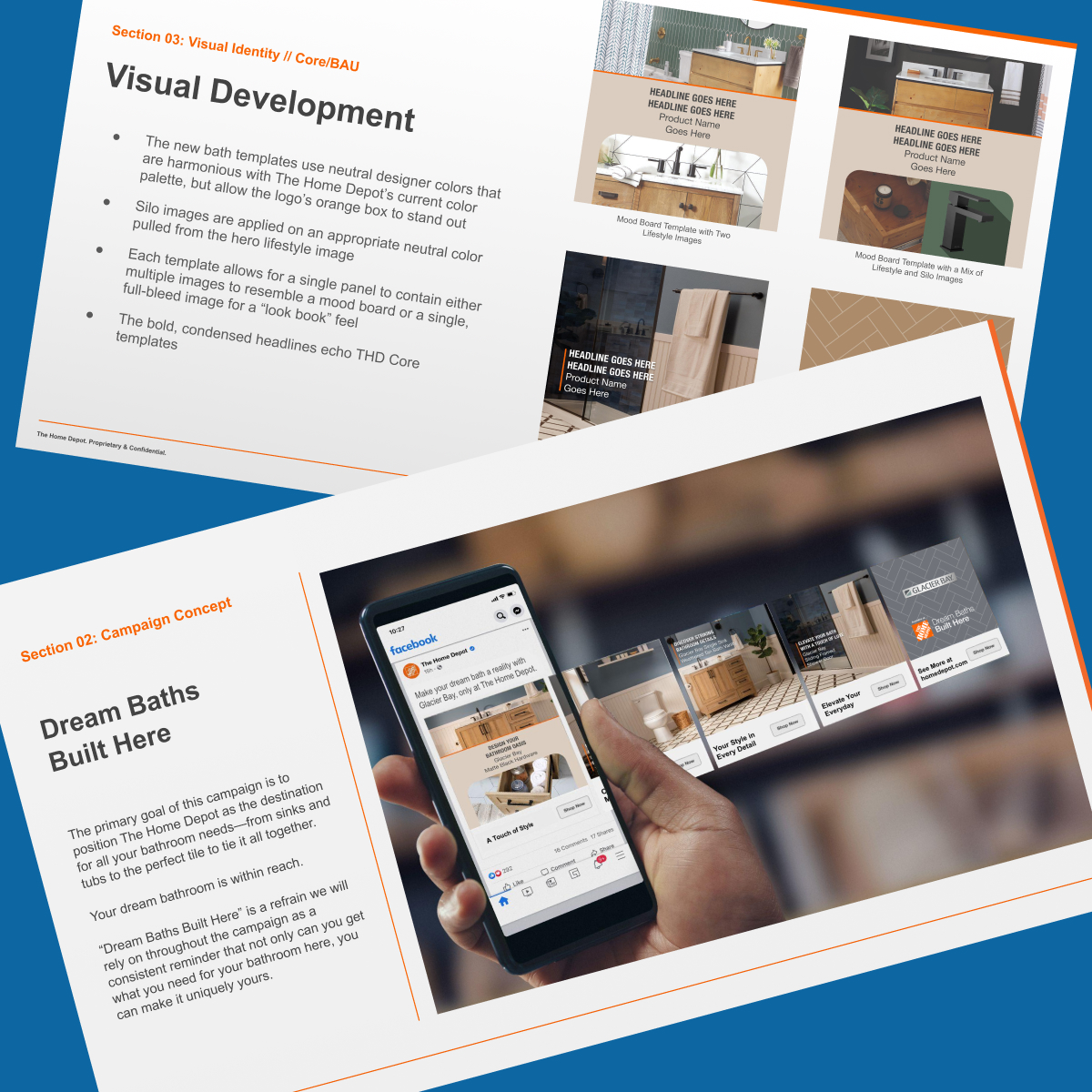
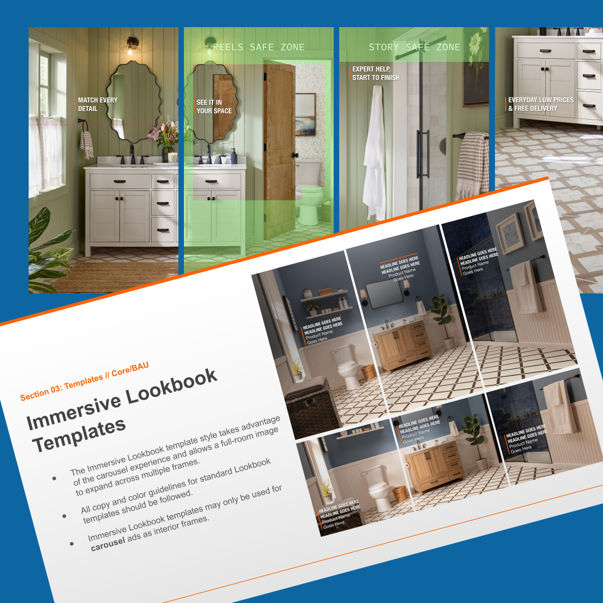
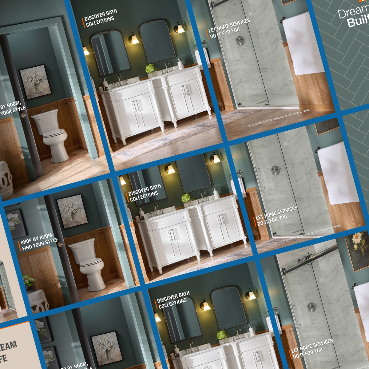
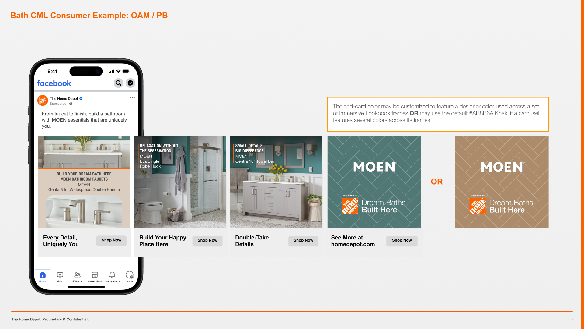
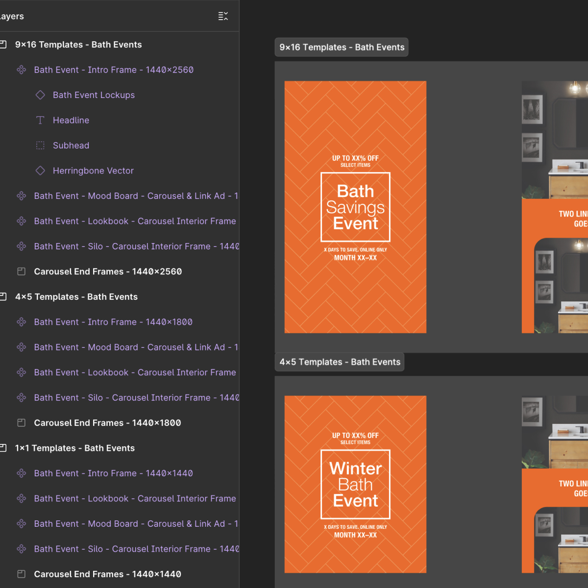
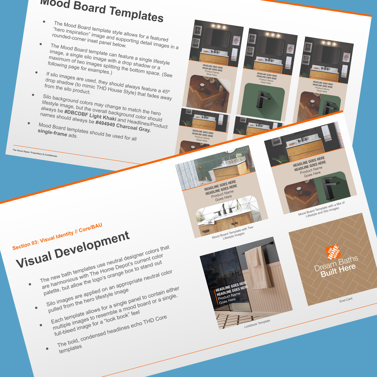
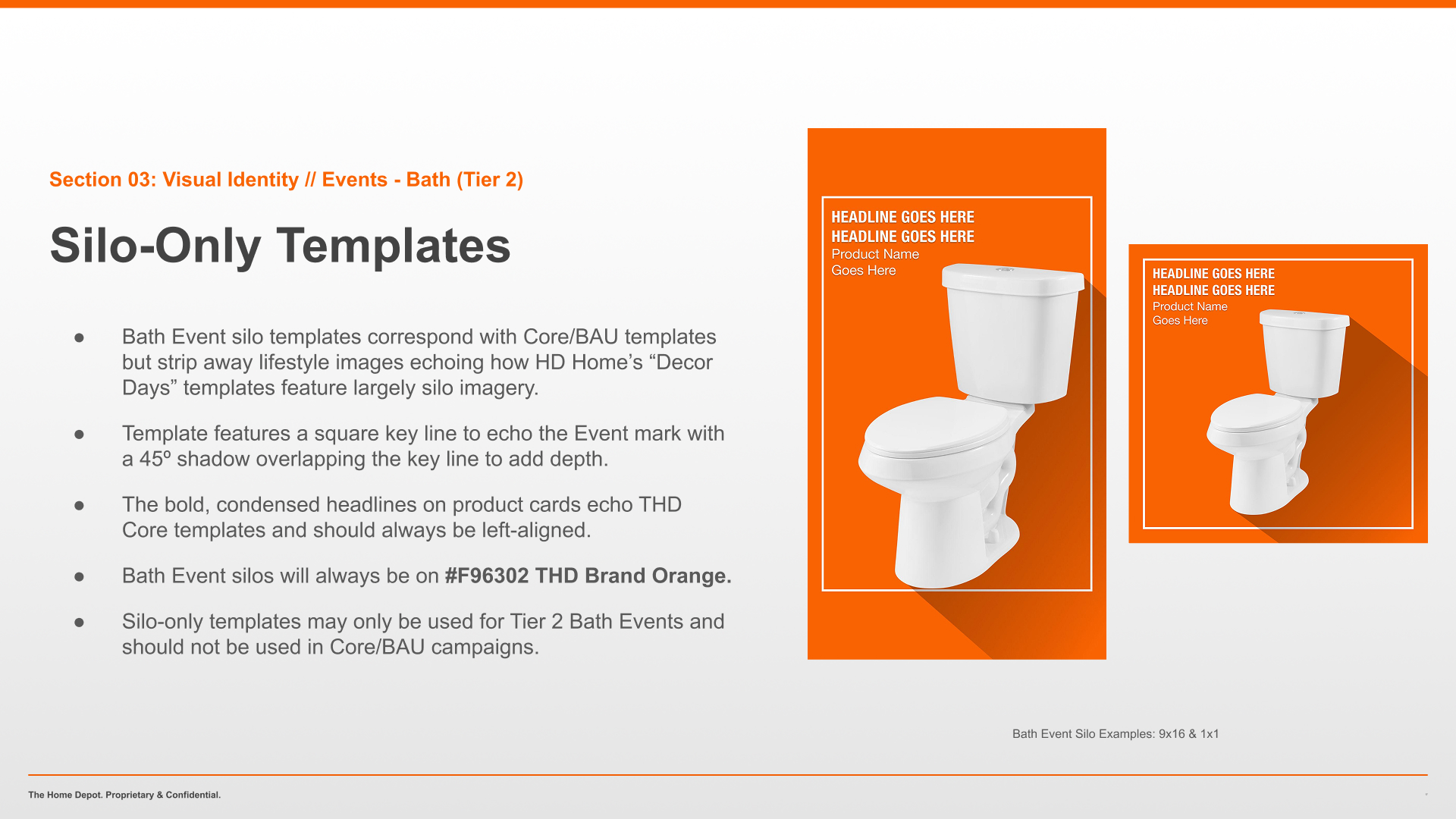
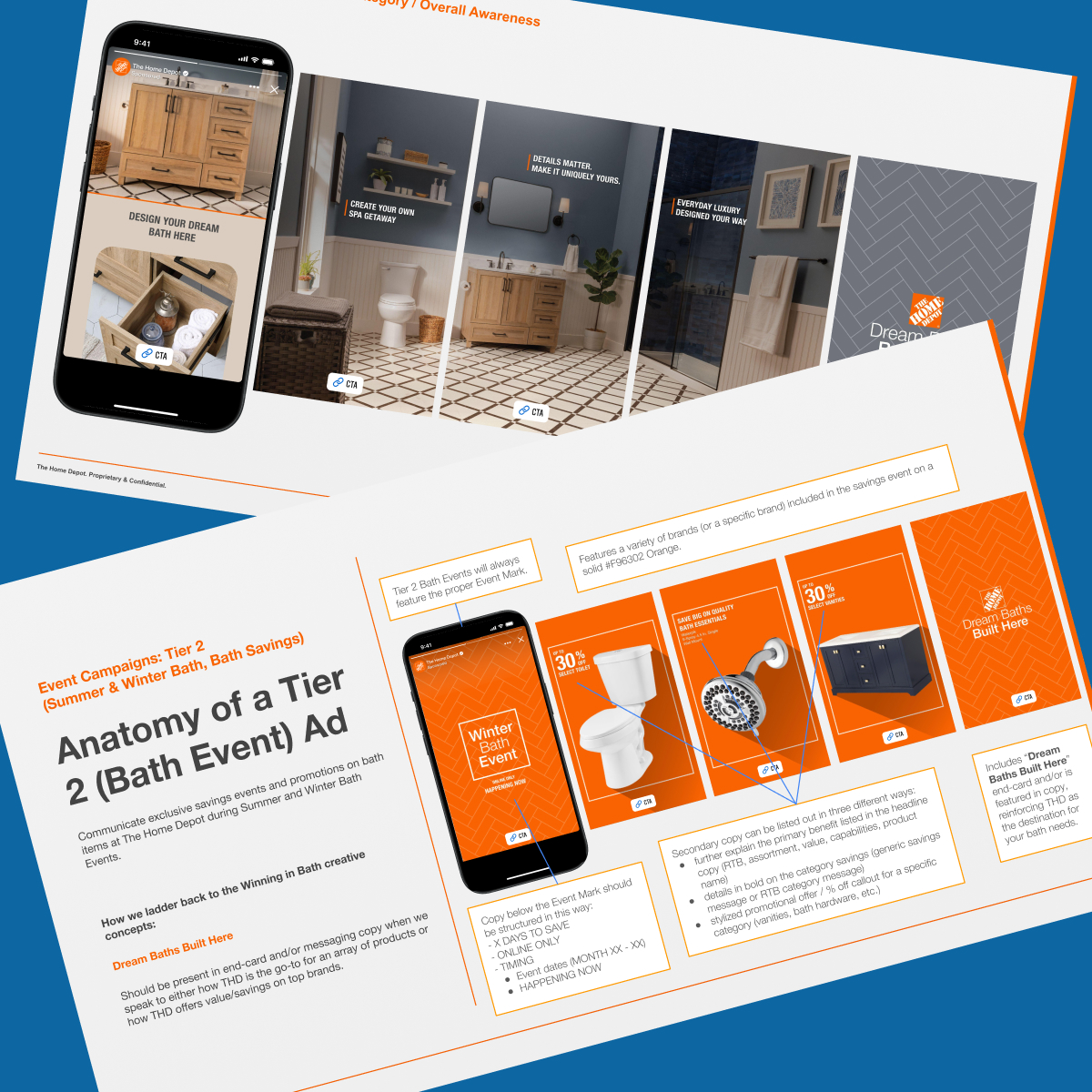
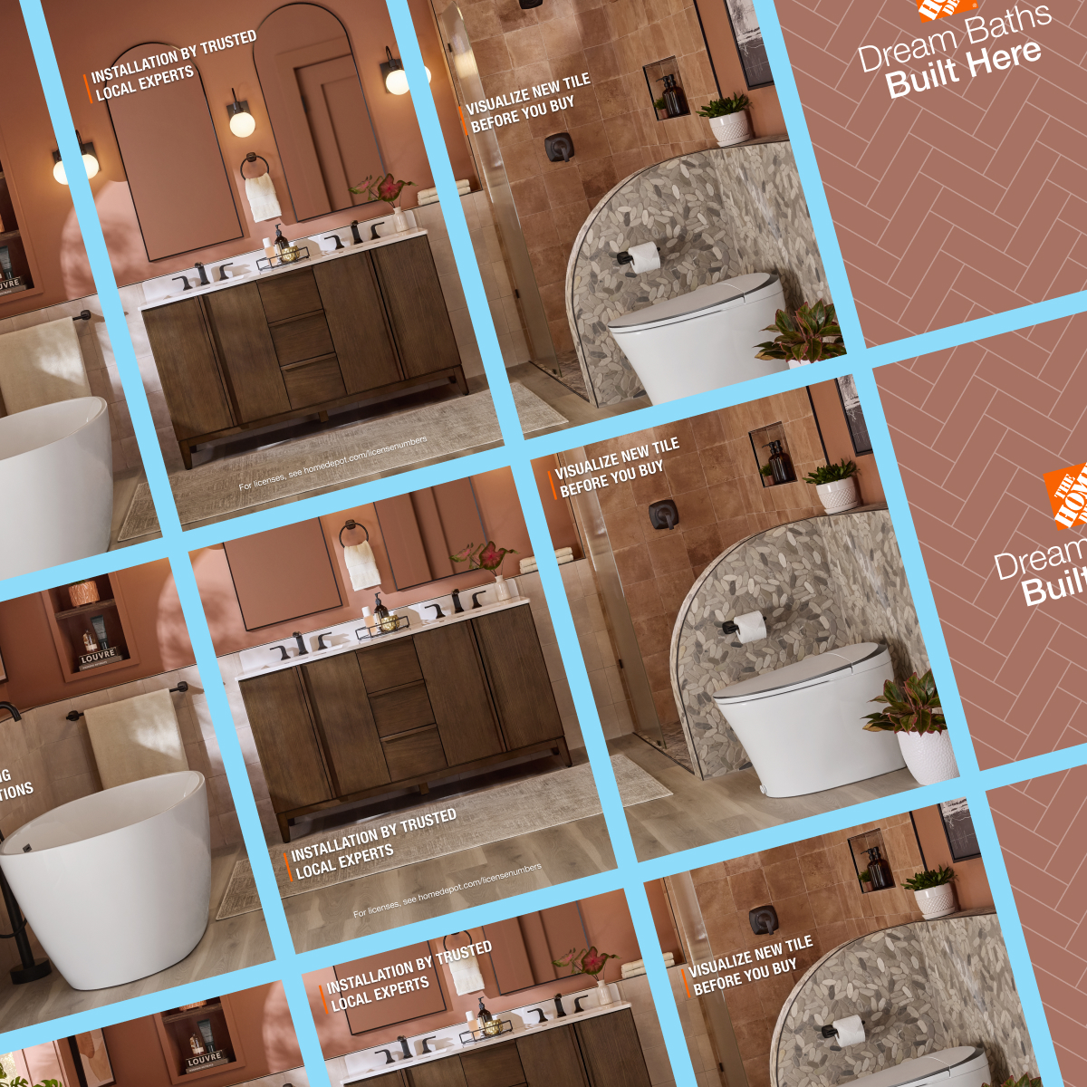
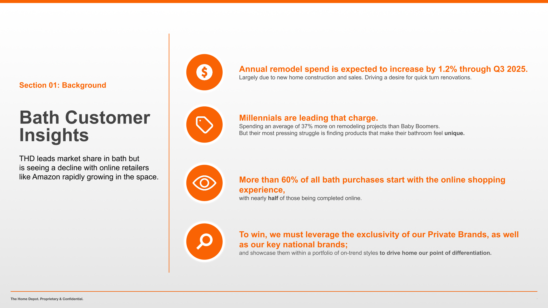
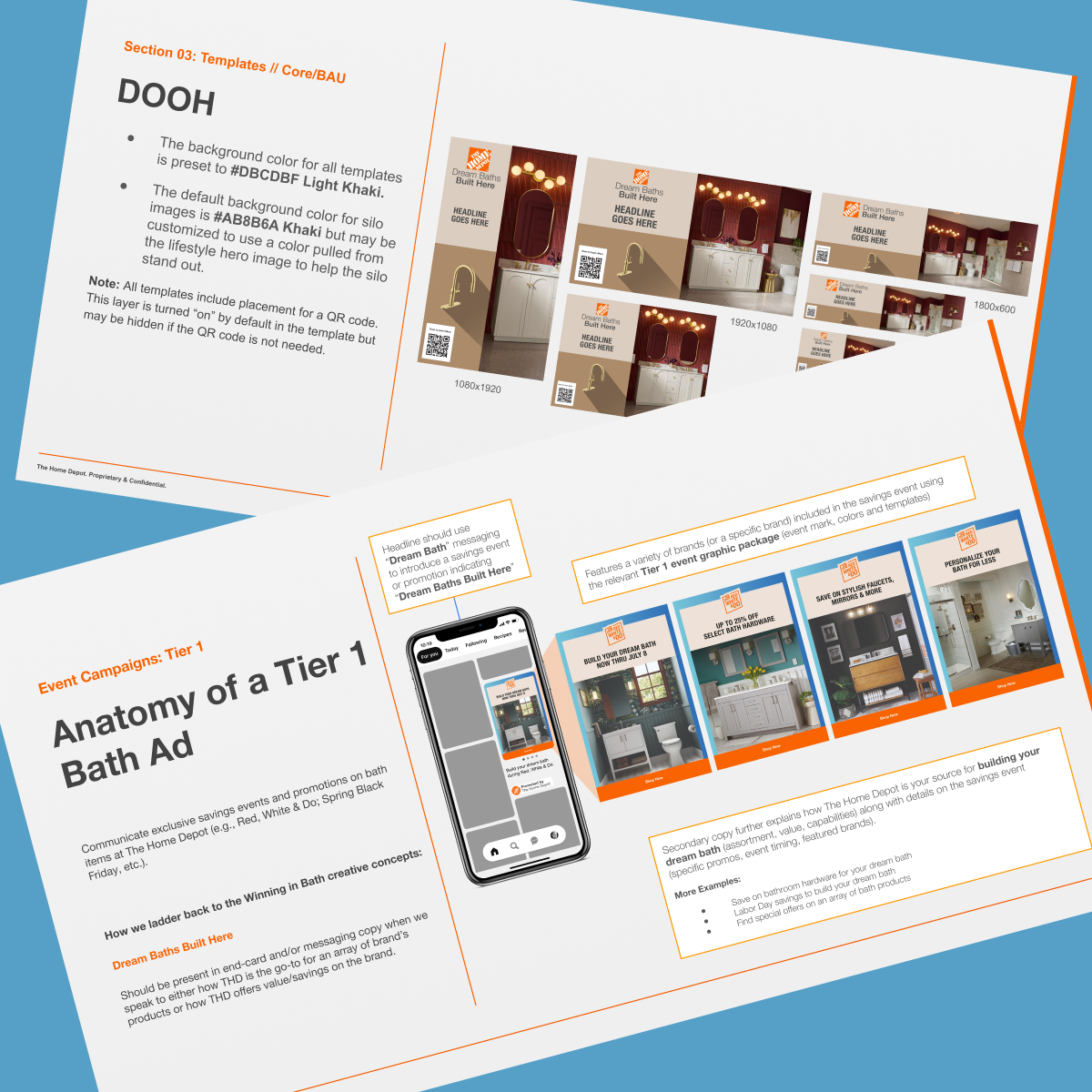
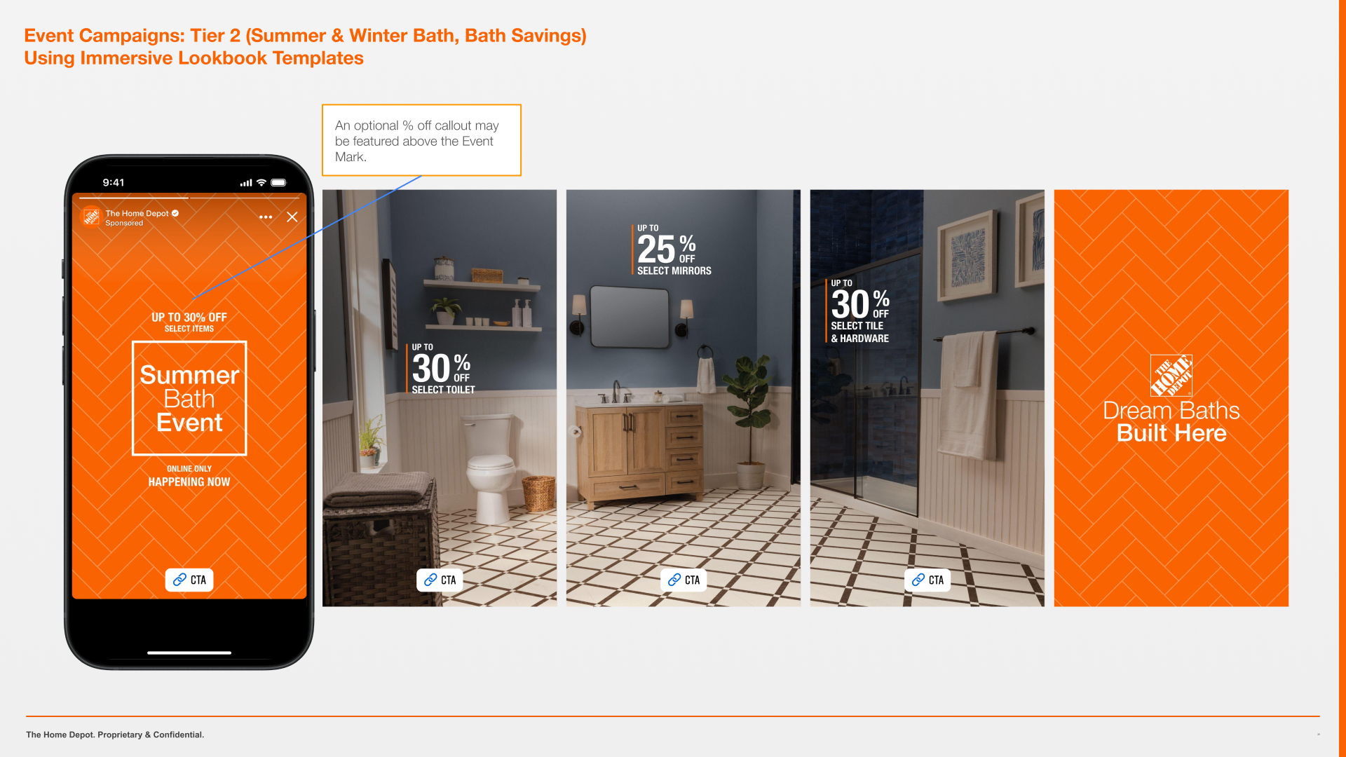
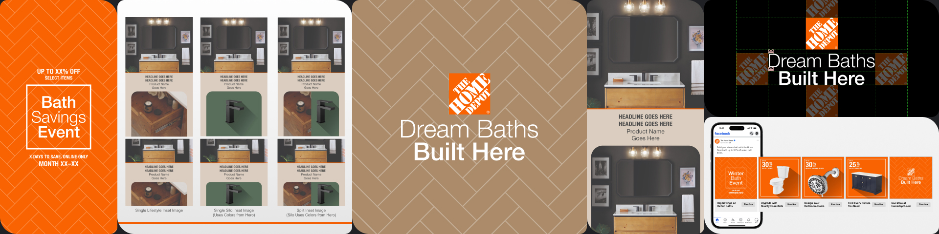
The Home Depot went through a period of elevating several product categories via “surges,” where those categories would receive a slightly different design treatment that still felt very “Home Depot” but separated them from the core ad look. The categories we were asked to create custom templates for in 2025 were Cleaning, Smart Home, and Bath.

Their in-house name for this campaign is “Winning in Bath,” but that feels very Inside Baseball speak, so I’m calling it by the “Dream Baths” tagline we came up with.

Bath had a very different objective than Cleaning or Smart Home had. Cleaning was all product awareness because most people didn’t know what a wide range of cleaning products The Home Depot carries. Smart Home was reminding people they didn’t need to order Smart products online but could come get them at The Home Depot.

Bath was about inspiration. Every quarter, a new set of trending bathroom looks would be released by the team at Studio Orange, so our new design system had to be the most flexible yet because it had to adapt to color palettes. The clients we worked with also want an “elevated” look that fle tmore like a magazine ad than a social ad unit. LaNorris came up with the idea of extending the photos across several frames and shrinking the text so it felt more like a catalog description than a huge product feature. Orange was used very minimally in the non-Event ads: there are only hairlines of orange versus the big blocks seen in the Core business style.

And because there are Bath-specific sales events throughout the year, we had to design the system to adapt for those events so the Orange Apron Media (OAM) team could sell them.

The Team

Trade School


The Home Depot

Defend and grow The Home Depot’s position as a market leader in the Bath category

The major client request: elevate the Bath templates. Essentially, make everything look like a “Veranda” ad or Pinterest Pin. No thick orange bars as the holders for baked-in text on the lifestyle images. In fact, only subtle hints of orange to tie the ads back to The Home Depot to allow the lifestyle photos to shine.

LaNorris is a photographer outside of work, so the idea of lookbooks became a driving force behind the carousel designs. He came up with the idea of the “immersive lookbook” template because so many of the photos we were provided from Studio Orange were extremely wide and served the purpose of room inspiration better when they could be stretched across several frames.

The design system had to be flexible enough to account for supplier-sponsored ads for the Orange Apron Media (OAM) team, as well as include a color palette that would work with The Home Depot’s Tier 1 and Tier 2 sales events.

Our non-Event ads feature lifestyle photography heavily with an occasional silo / cutout product shot; whereas the Event ads are driven by silo photography.