Dippin’ Dots Menu System
In-House Enterprise-Level Creative Direction & Design for Dippin’ Dots Ice Cream | 2007-2009
What kicked off this whole project was a combination of two things:
1. Me being tired of photographing the same flavors over and over again in different cups
and
2. Some on-the-ground, real-life UX research
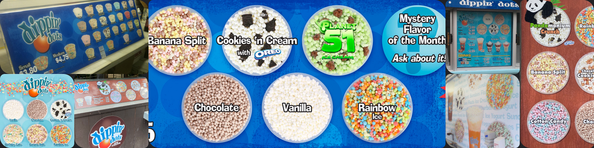
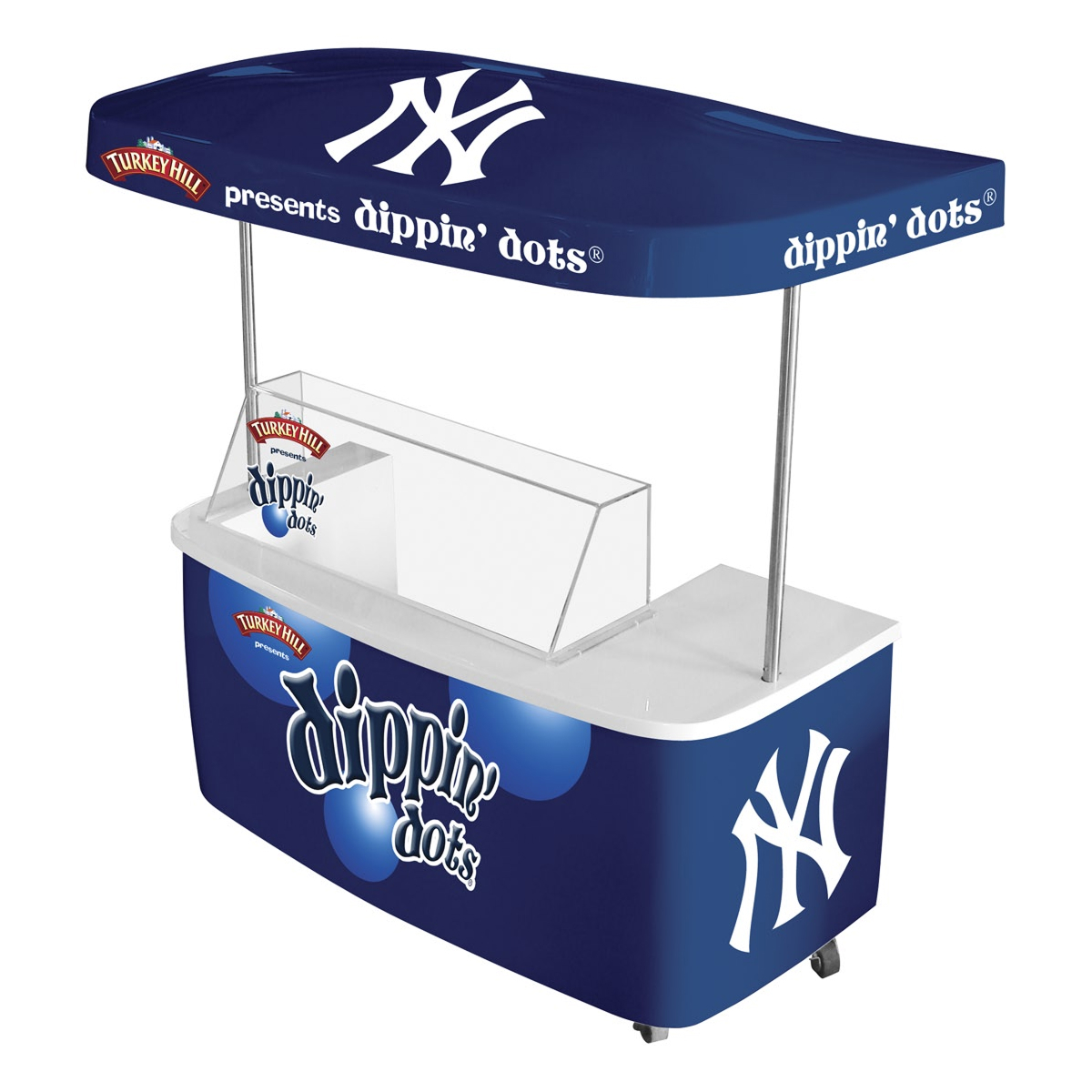
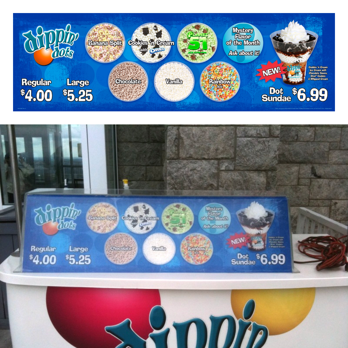
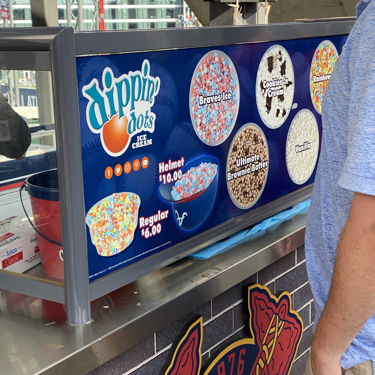
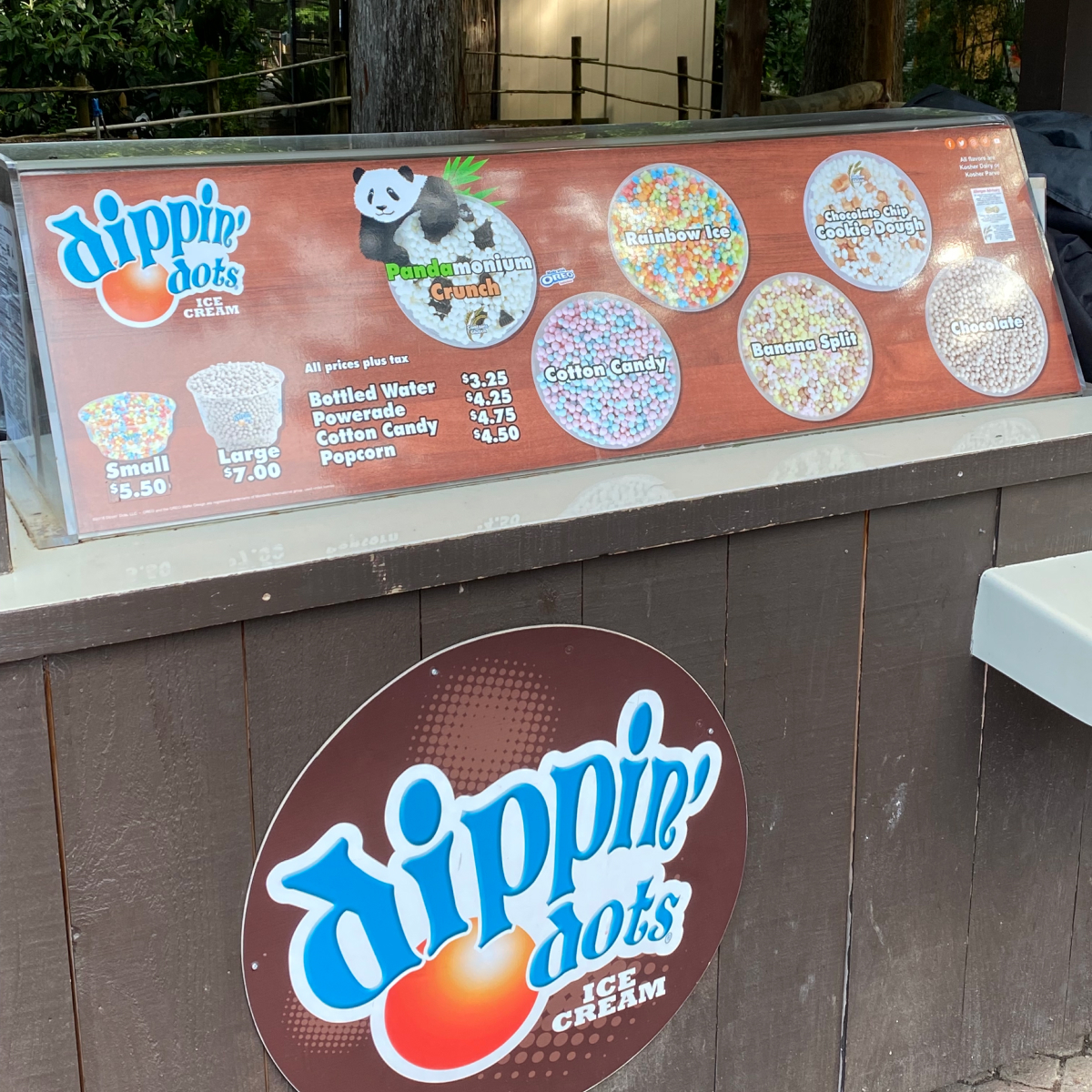
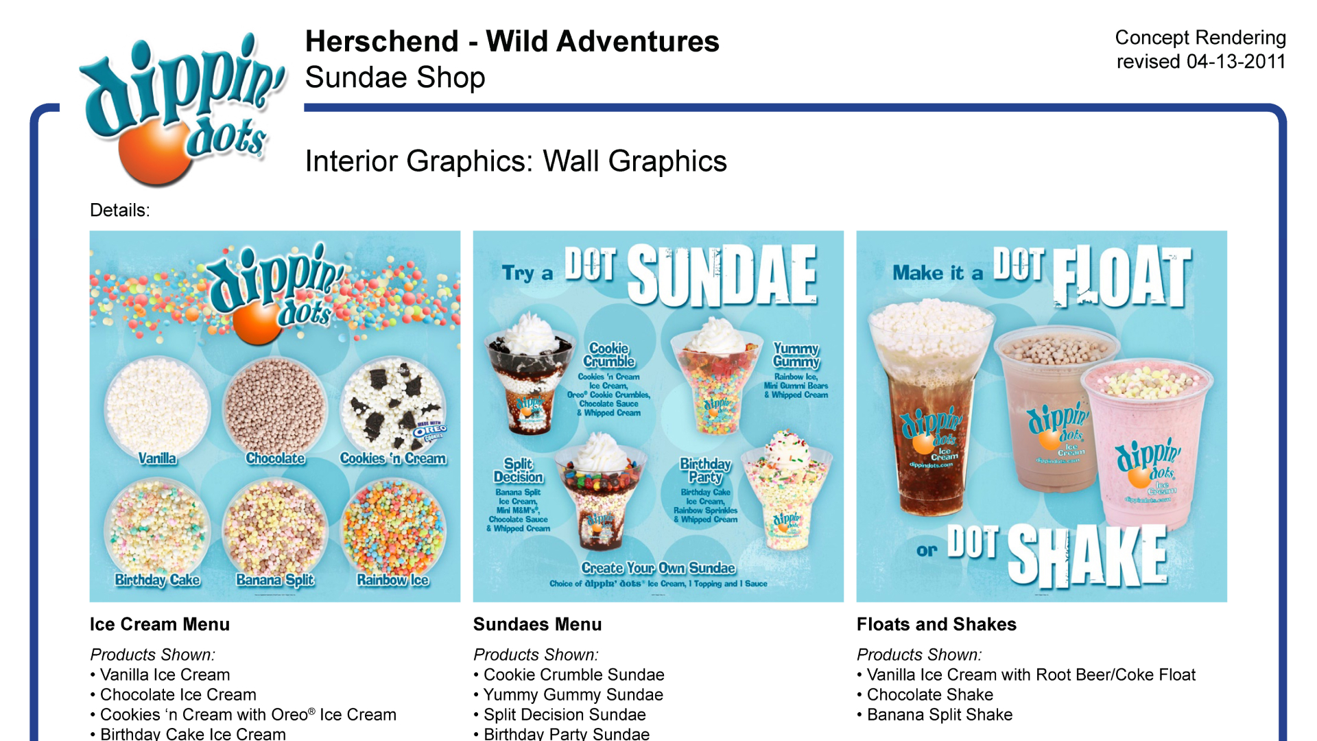
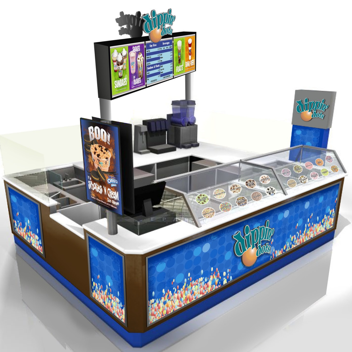
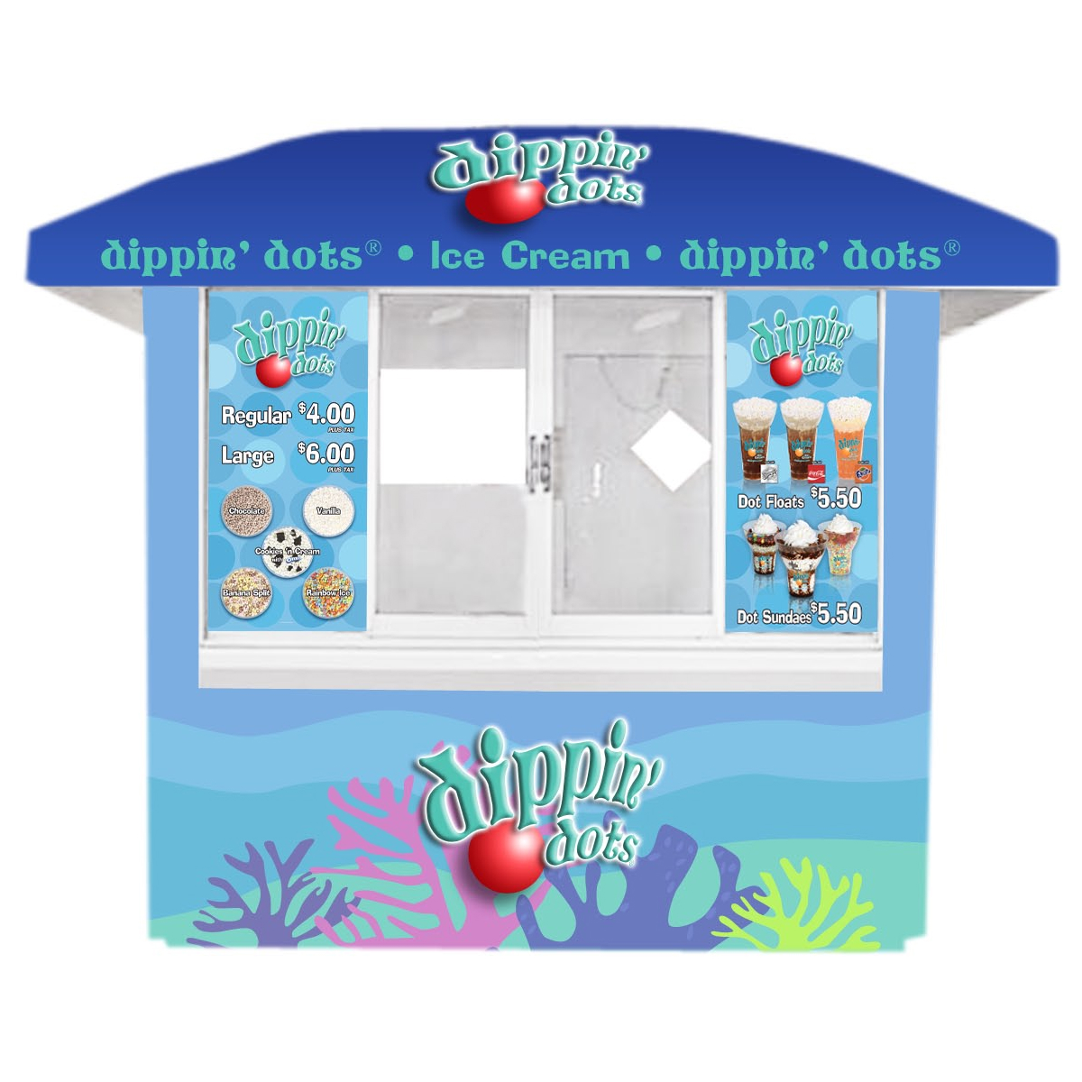
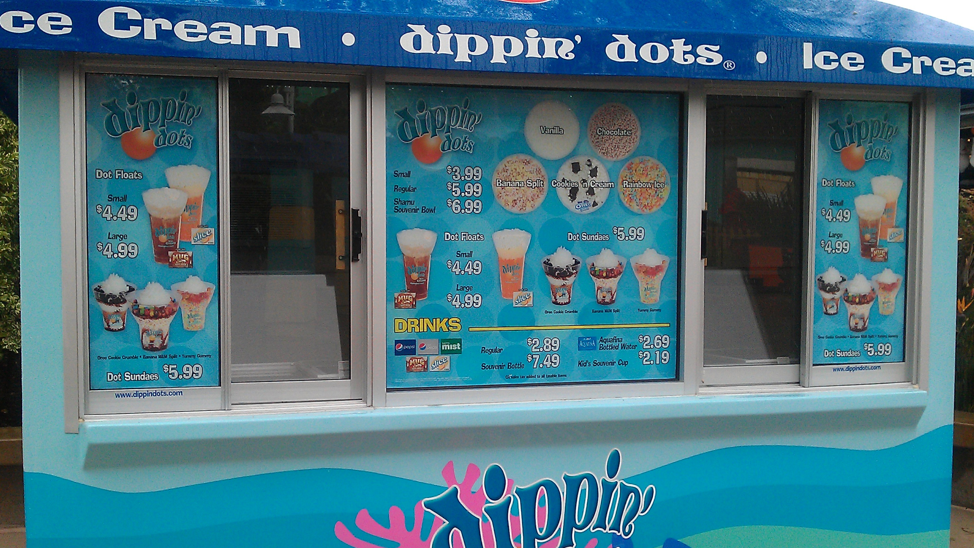
Dippin’ Dots sold “official” branded cups, but only franchisees were required to use them. National accounts like Aramark, Six Flags, Universal Studios, the Atlanta Braves, etc. could use whatever cups they wanted to. And they all wanted photography for their individual POP Triangle graphics on their carts.
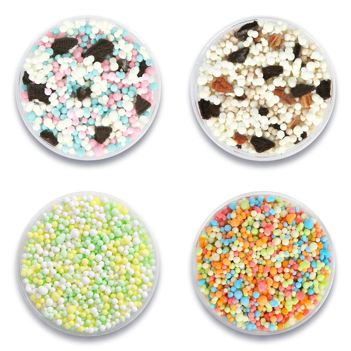
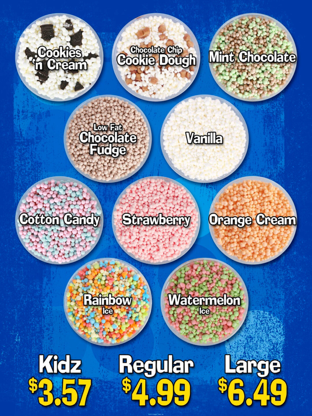
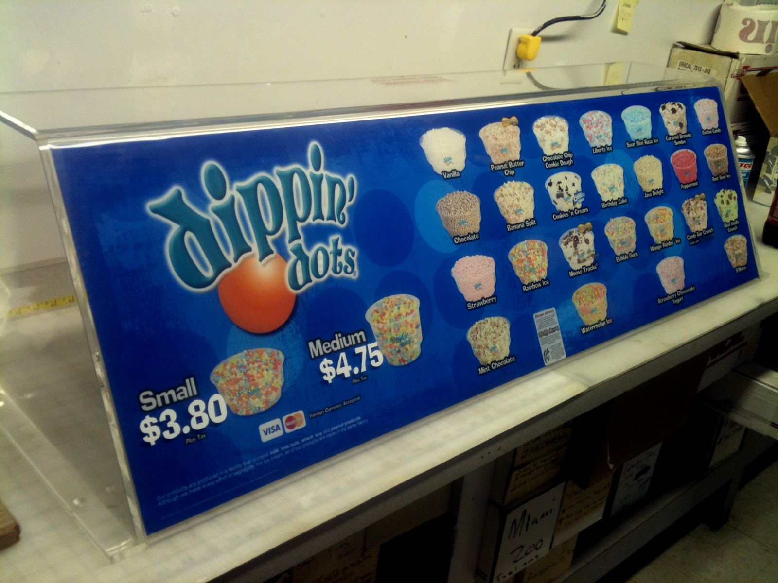
The best photos of Dippin’ Dots are shot using lab-made Dots rather than those that came off the production line. Which meant I spent hours in the microbiology lab at the corporate office making “Lab Dots” by dripping liquid ice cream bases through pipette trays into a 5-gallon bucket of liquid nitrogen. I had to make new Lab Dots every time an account changed its cups for the new year.
Dippin’ Dots also went through a logo update while I worked there, so all of our photos of the “ring logo” cups were now obsolete thanks to the new “warped” logo.
The overhead cup shots were born out of my never wanting to deal with custom cups again, because now you couldn’t see the cup.
I re-shot every flavor as an overhead over the next 18 months, because I had to work around when certain flavors were being manufactured to get the proper ice cream base color to make the Lab Dots. Some flavors like Vanilla are made every week because those Dots are part of so many flavors (Cookies ‘n Cream, Moose Tracks, Banana Split, Candy Bar Crunch, Chocolate Chip Cookie Dough), but a less-common flavor like Tropical Tie Dye was made only once a year.
At the same time, believe it or not, I’d joined the Sales Team and had Southern Missouri and all of Oklahoma as my sales territory. This was an excuse for me to get out of my cubicle in Paducah once a quarter and give some love to a handful of accounts that had previously been lumped in with Texas. And Texas was a full-time job, which meant all of my accounts hadn’t been visited in over a year when I started with them. They all needed a good “shot in the arm” to reinvigorate their passion for the product, so I used them as an experiment.
For the first time ever, I had an opportunity to see “how” people interacted with the brand at a theme park, attraction, or stadium. To see how the work I’d been doing as a Creative in Paducah was being received IRL.
Up until that time, the POP Triangle on every cart had a text-only menu list.
It wasn’t ideal.
Kids don’t order off a list – they want to SEE the ice cream, and only really big accounts (Universal Studios, Sea World, Six Flags) were allowed to have custom photos.
In addition to using my accounts in Southern Missouri and Oklahoma, I enlisted the help of Caleb Watters, who had the rest of Missouri and all of Illinois and Wisconsin as his territory. Between us, we convinced a few accounts that had multiple carts at their locations to try out a new menu system at one cart per location: a menu that attached to the inside of the cart’s sneeze guard and was almost entirely photographic.
The problem: the vinyl for the inside of the sneezeguards was MUCH more expensive than the laminated cardstock graphics that fit in the POP Triangle, so not only did we have to prove that the new sneezeguard menus were going to be more effective, but they had to sell a significantly higher amount of ice cream to justify the investment (since Dippin’ Dots paid for all the POP that went up at any location).
We needn’t have worried.
The carts with the new menus outsold every other cart in the same theme park or venue by a margin of 5 to 1 – just by putting pictures of the ice cream on the menu rather than a list of flavors.
Post Mortem
Dippin’ Dots is still using the photos I took in 2007. They’ve dressed them up on the website a little bit by Photoshopping in some flavor garnish around the cups, but the main ice cream shots are the ones I took and painstakingly cut out.
I can tell the original ones I made Smart Objects of (so they could be easily swapped into the grid design I’d created) compared to the flavors they’ve shot since I was let go in 2011 – take a look at their website, and you’ll immediately notice the new flavor shots are smaller.
And they’re still using the same menu design I created in 2009. I have a good laugh every time we go to Zoo Atlanta or Truist Park and I see my almost 20-year-old photos and a 15-year-old menu design still in use today.
Pictures.
Sell.
More.
Ice Cream.
The first of the overhead cup menus to go in – you can tell it’s pre-season because the electrical cables to hook up the freezer are on top of the cart where the register / POS system would go.
The main reason I’ve included these menus in my portfolio for so long is that Dippin’ Dots is STILL using my design and product shots almost 20 years later.
I designed a number of “Sundae Shops” that went into larger amusement park concessions spaces – and they all started using the photographic menu system as soon as we made it available.
As seen at Zoo Atlanta in early 2026 on one of their 8×10 carts.
Concept renderings for themed 8×12 and 8×10 carts in the “Sesame Street Bay of Play” section of Sea World San Diego.
These were the first “standard” carts to get the all-photographic menu vinyl on the windows.
The whole aesthetic of Great Wolf Lodge is already pure chaos…
So of course they decided to add Espresso Dots by the spoonful to their menu when we launched Dippin’ Dots Coffee in 2009…